Project Goals
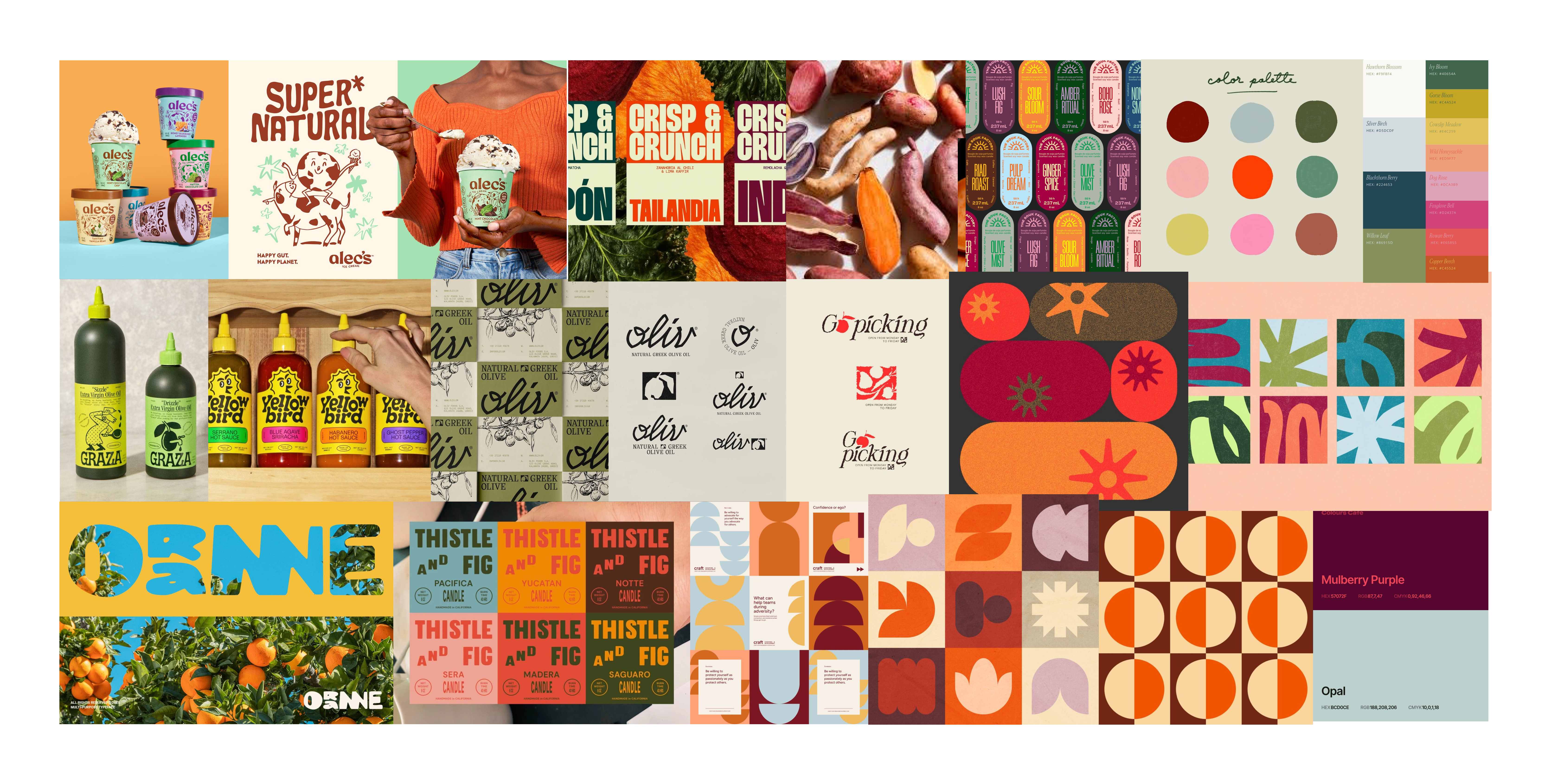
Yam! Sweet Potatoes is a brand redesign focused on transforming a generic pantry staple into a cohesive, character-driven identity. The goal of this project was to refine the existing playful visuals into a structured, versatile system that clearly communicates personality, energy, and approachability. By balancing bold expression with strategic design decisions, the rebrand strengthens shelf presence while making sweet potatoes feel engaging, nutritious, and easy for families to choose.
Process & Solution
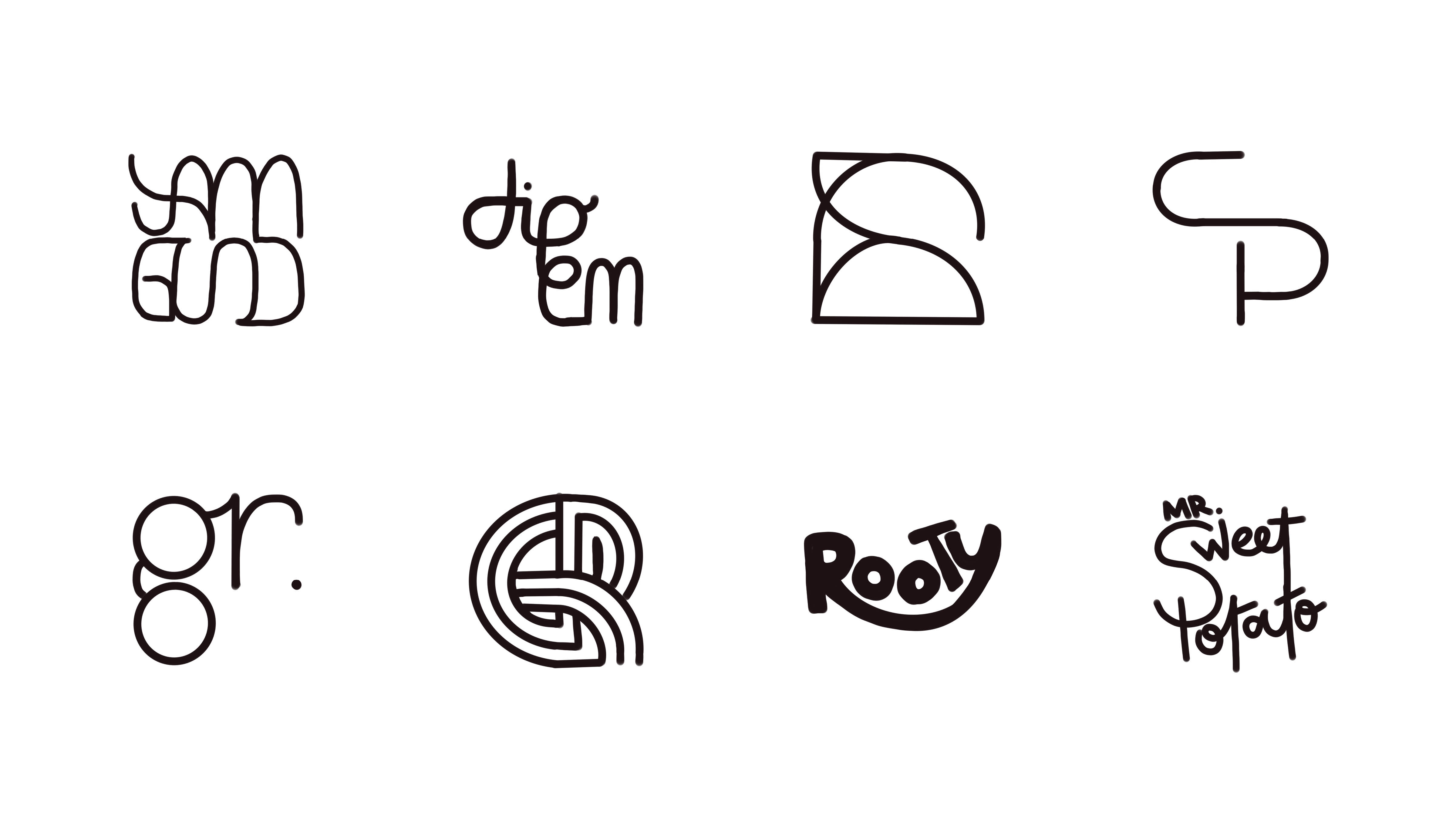
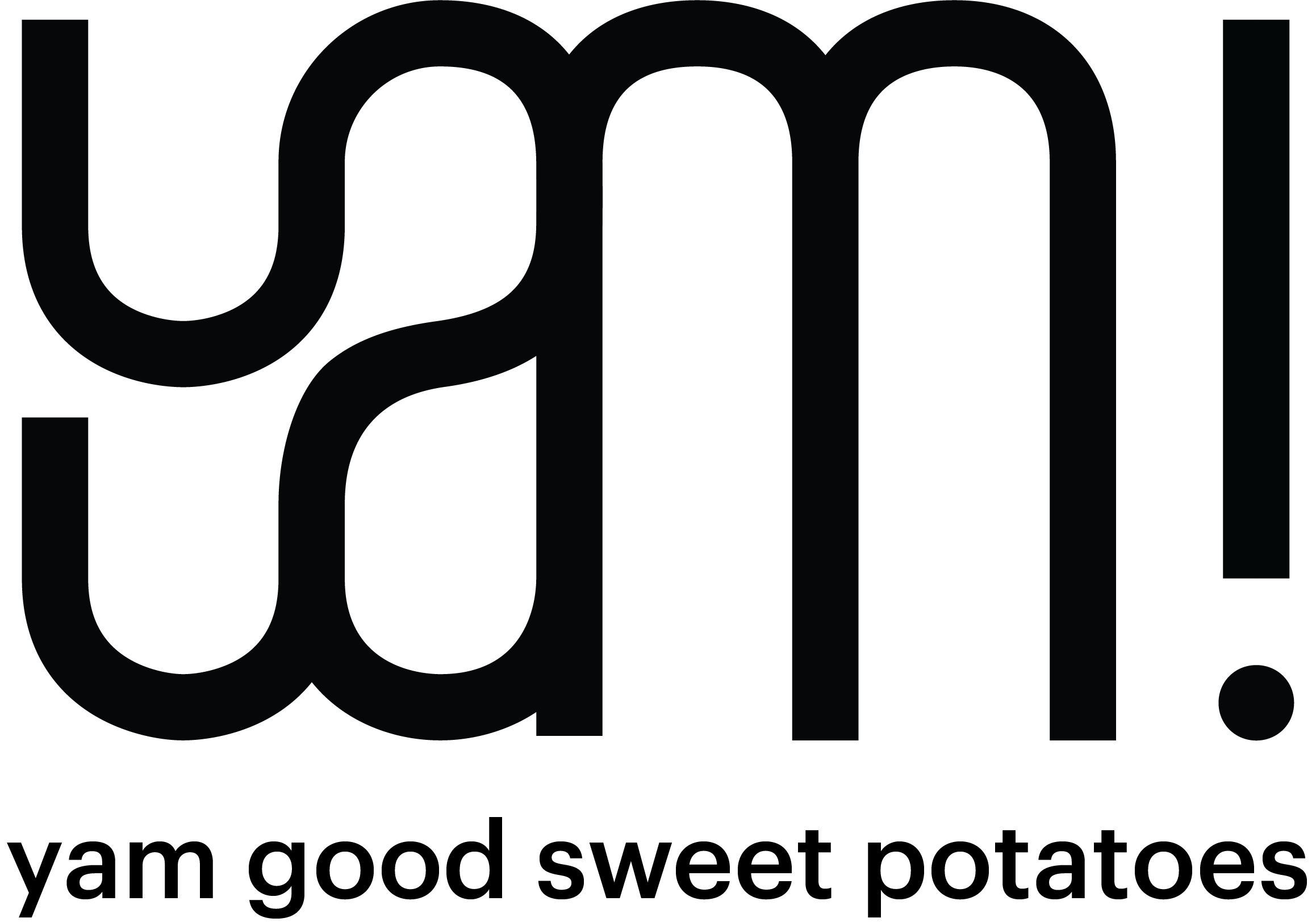
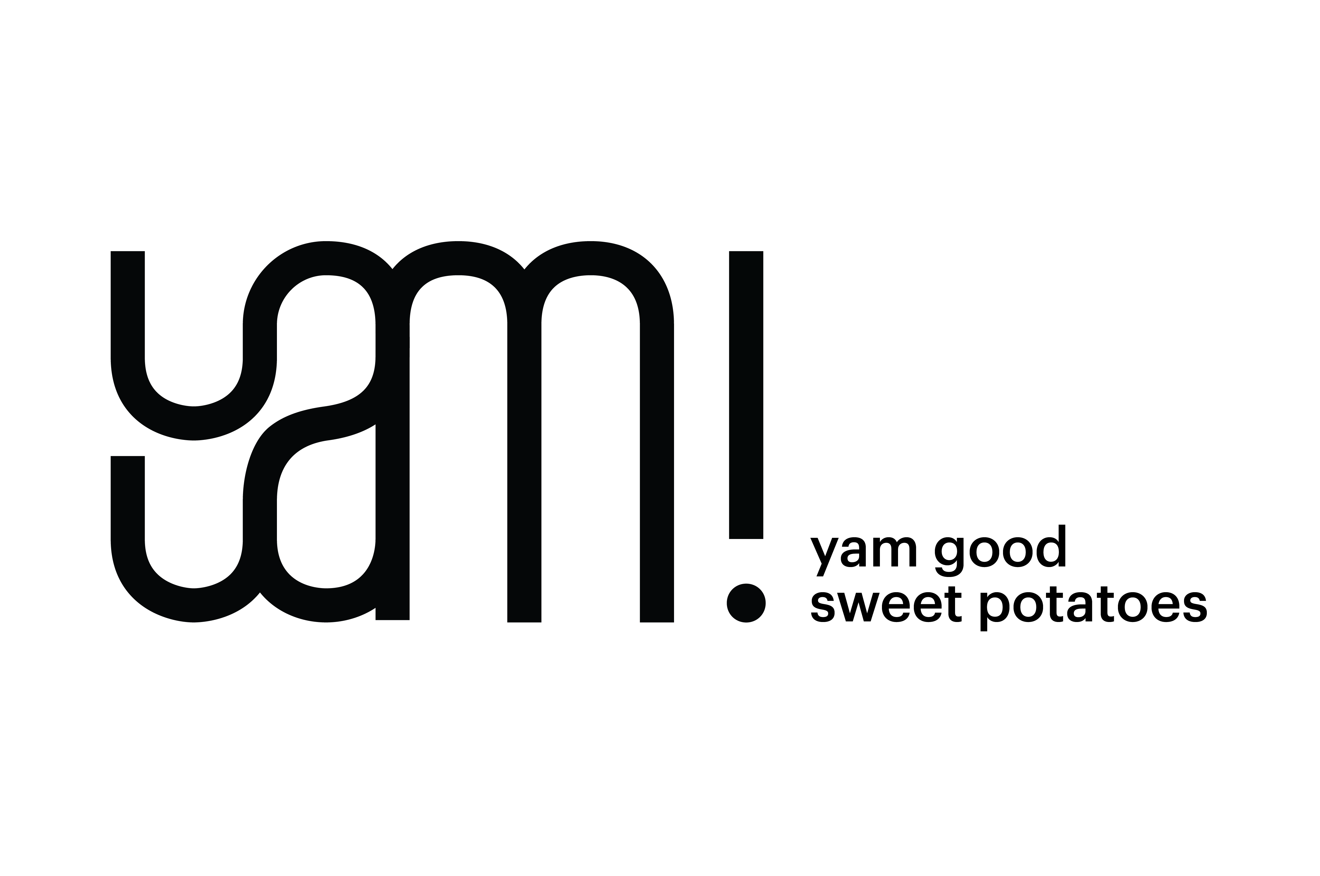
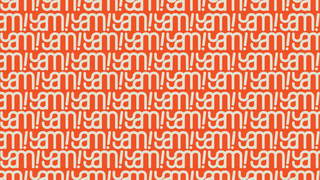
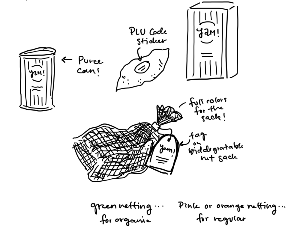
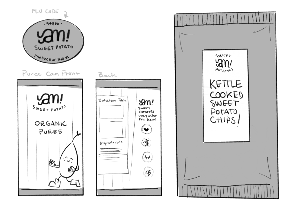
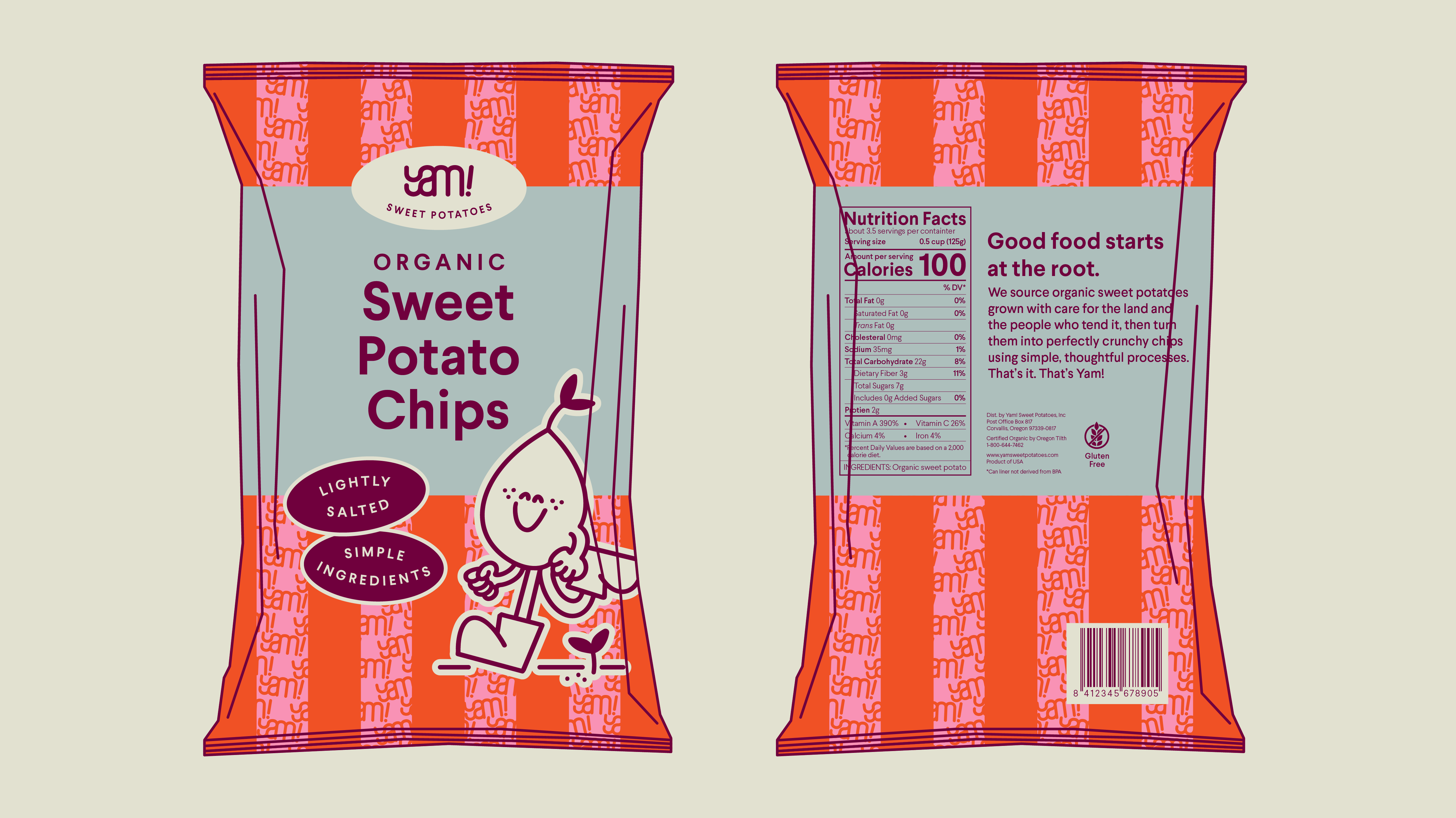
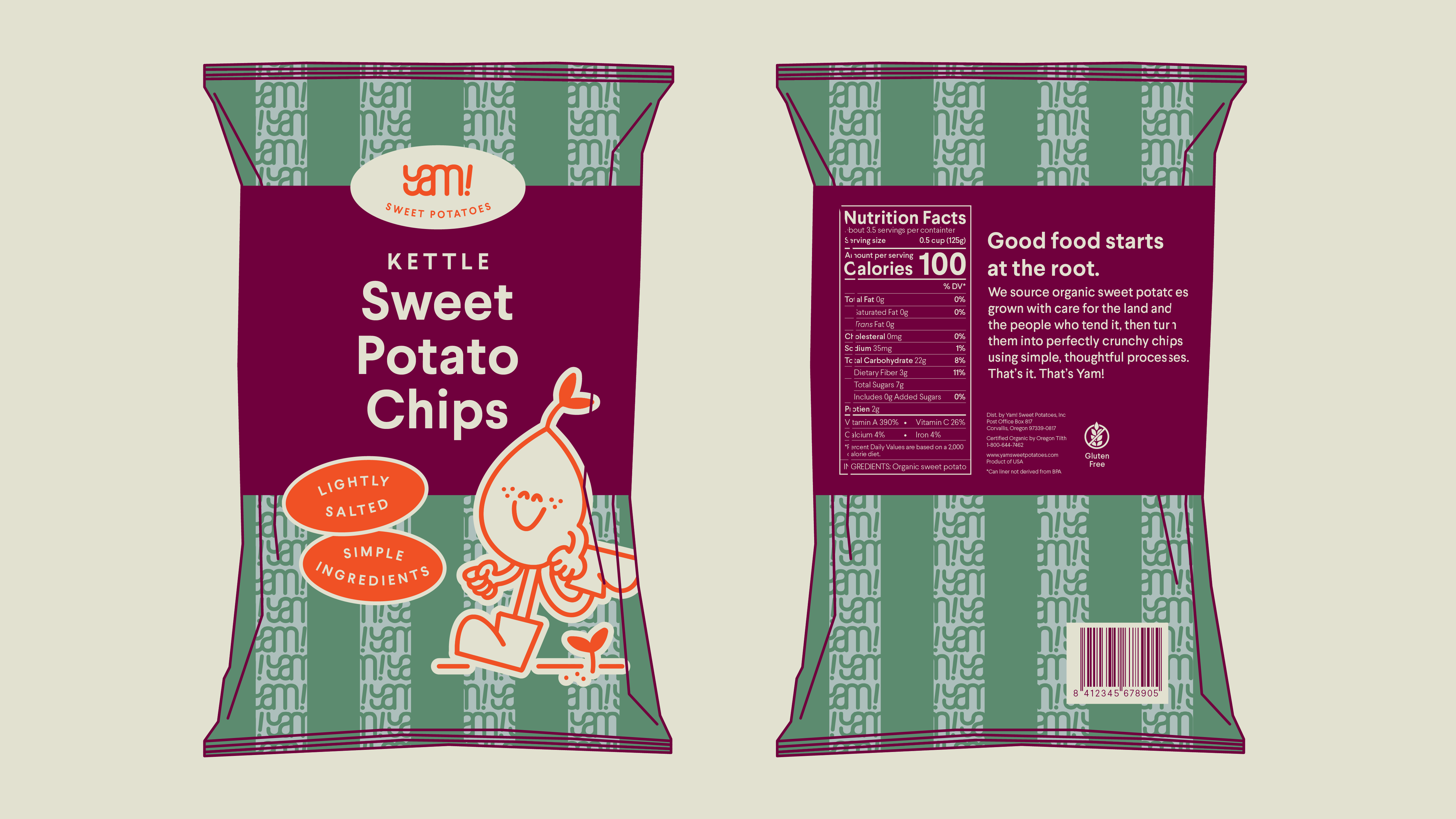
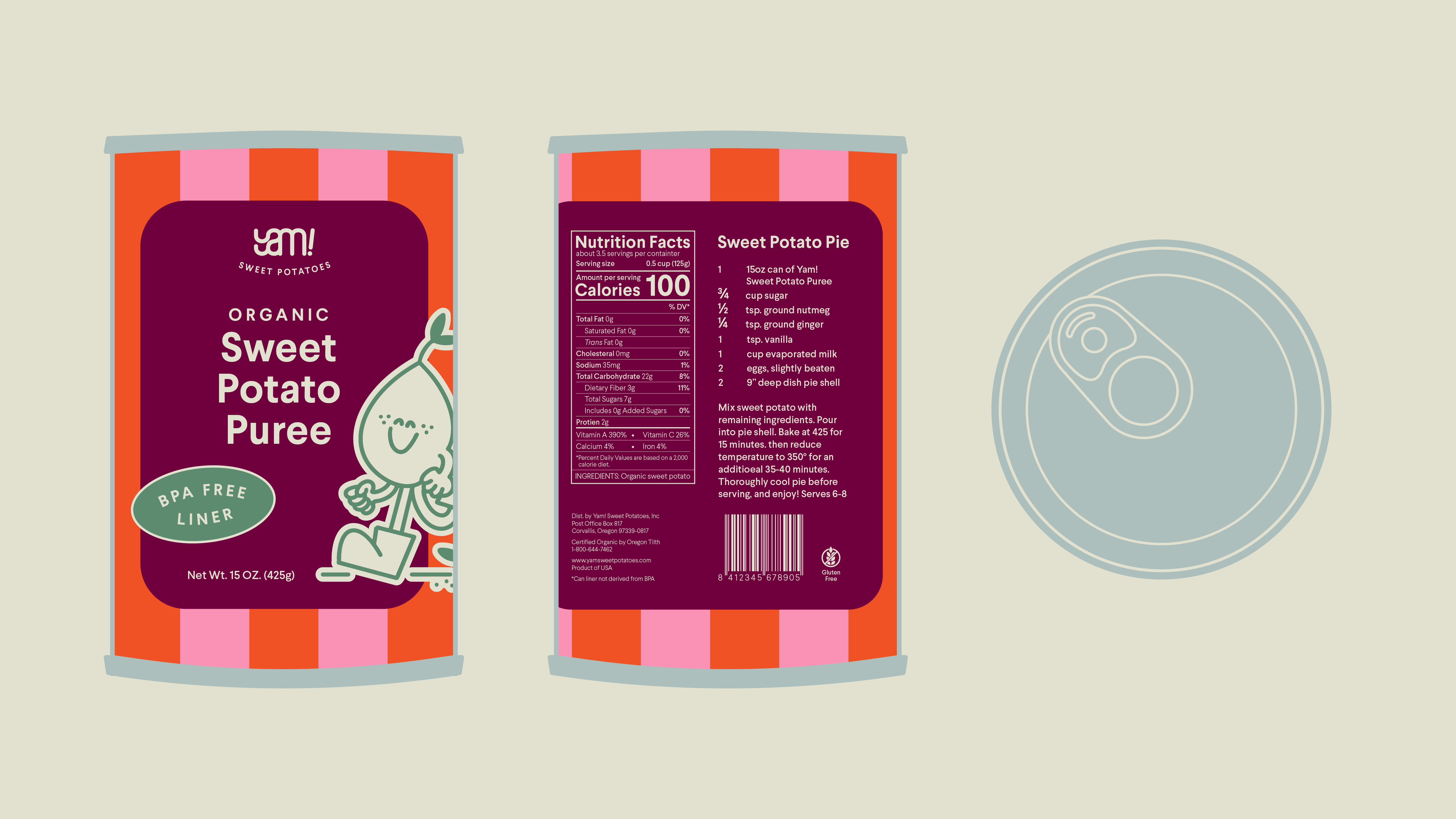
The redesign began with evaluating gaps in cohesion, movement, and scalability across touchpoints. I refined the custom wordmark, expanded the color system, and selected Larsseit typography to reinforce warmth and legibility. A playful mascot and repeatable pattern system were developed to unify packaging, produce bands, and product extensions. The final solution delivers a flexible visual identity that enhances consistency, strengthens brand recognition, and translates seamlessly across retail applications.