Where Fast Food Meets Faster Decisions
Tired of waiting in those never-ending drive-thru lines? We’ve
got you covered! With our app, you can skip the wait and order your favorite food ahead of time. Whether you’re rushing between classes or juggling family life, Waiter makes it easy to grab a quick meal without the hassle. Order, drive or deliver,
and enjoy—fast!
Project Summary
Waiter is a user-focused app concept designed to address consumer frustration with long drive-thru wait times. Targeted at busy individuals like college students and working adults, the app streamlines food ordering by providing real-time wait estimates and optimizing the ordering experience. Developed as a group class project, the work was collaboratively split among three team members, showcasing strong teamwork and project management skills. The team conducted extensive user research, including interviews and surveys, to create a solution that highlights user experience design, problem-solving, and the design thinking process.
My Role
My contributions were the creation of a cohesive user experience in the design and visual identity of each feature of Waiter, a logo design to convey the app’s focus on navigation and time efficiency, and collaborated in various types of research such as conducting SWOT analyses, empathizing and interviewing, cognitive walkthroughs and heuristic evaluations.
Read more on the Project Brief
Problem
Many consumers face frustration when purchasing food from mobile ordering services, particularity when inefficiencies lead to wasted time. Other issues that users likely experience when ordering food is the lack of convenience, safety, and authenticity of information updates provided from third-party ordering apps. For example, users have a lack of trust when it comes to wait time updates, security of personal information, and the availability of restaurant services, thus causing dissatisfaction and skepticism.
The target users for this solution are busy individuals that desire to use their time wisely when it comes to exploring, ordering, and receiving their food orders. In this app, the goal is to support users that do not have time to cook or individuals who prefer a more efficient way of getting their food without the delay of long wait times or inconvenience. This group of users could consist of college students, busy parents, or anyone that is in search of restaurants with quick service.
Project Challenge
Long wait times in drive-thru lines frustrate consumers, especially college students and busy parents who need quick and efficient service. To address this, I conducted user research through interviews, identifying pain points in the ordering process. The goal was to design a solution that optimizes time management and improves user experience.
Solution
I led the design and visual identity of Waiter, an app that streamlines food pickup by providing real-time wait estimates. Using Figma, I created a seamless UI, ensuring an intuitive user flow and consistent branding. I also designed a logo that visually communicates efficiency and navigation. My role extended to user research, refining the design based on real feedback to enhance usability.
Competitive Analysis
As the project progressed, research and an in-depth analysis of the app’s competitors was conducted to create problem-solving decisions based off their strengths, weaknesses, opportunities, and threats. As the research deepened, it was understood that the market for an efficient food ordering app that provides delivery, accurate updates from ETAs to ordering wait-times, and navigational services is very competitive with multiple successful apps such as Uber Eats, Yelp, DoorDash, independent restaurant ordering apps, Grubhub, and
Open Table.
This high level of competition is a threat for these pre-existing apps. However, these apps do well to provide accessibility and a simple, straightforward interface that allows the users to find exactly what they are looking for. Many franchises have their own apps that allow users to order directly and even get an estimated wait time. However, the main weakness of current solutions is the fact that they often lack in showing exact wait times of drive-thru lines. Many times, a user will order through the app and arrive to pick it up, but they still must wait in a line. Some current opportunities of these apps include updated technology such as quicker responses to wait-time updates and sudden delays in the ordering or delivery process. If a delay does happen, the user should be made aware of the issue as soon as possible and should inform the user whether a change should be necessary or not to save time.

“to make eating well effortless at any time, for anyone”
Strengths:
Provides a wide range of options, easy to navigate, and reliable
Weaknesses:
Encompasses many beneficial features but lacks displayed wait times
“explore and navigate your world”
Strengths:
Showcases the most populated times and inspired our map/directions
Weaknesses:
Suggests nearby restaurants but does not include ordering or delivery services

“connects people with great local businesses”
Strengths:
Provides insight into different restaurants with user reviews and ratings
Weaknesses:
Harms businesses and information lacks authenticity
Proposed Solution
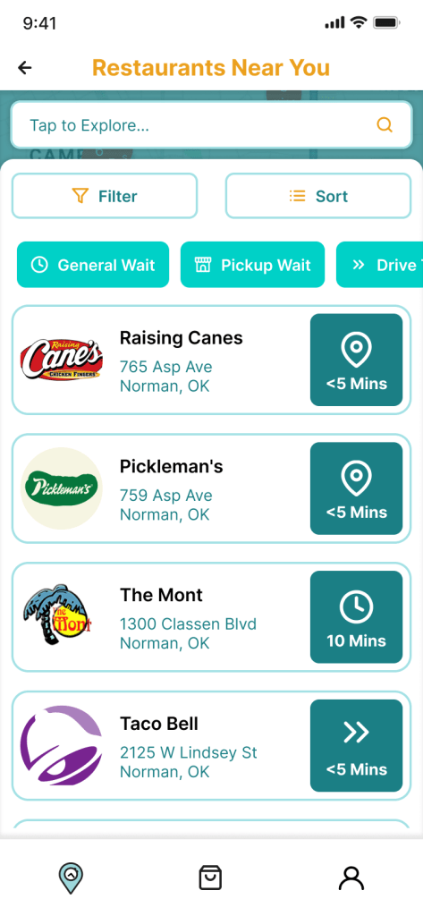
In the initial phase of developing an adequate and sustainable solution for inefficiencies through mobile ordering, multiple solutions were identified and then used as goals in the later stages of the design process. These solutions included displayed wait times being the focus of the app, gained trust of users and businesses, and an all-encompassing food app for mobile ordering and delivery. As the project progressed and these solutions had to be narrowed further, the design decisions made helped to create an informative and efficiently simple app through the addition so displaying restaurant’s most populated times, no additional fees on food items—rather, working alongside businesses and restaurants through providing customer feedback thus increasing transparency, and lastly, enhancing features such as the map for easier and quicker discovery, simple and secure delivery options, and specifying different wait times for each restaurant including pickup, directions, general wait, and even drive-thru.
Design Thinking Process
1. Empathize
Read More
The purpose of the interviewing process and demographics of the individual interviews is to gain a deeper understanding of the app’s target user and how to best meet and exceed their expectations, needs, and goals while also being informed of their pain points and how to best resolve those issues. To gather a deeper understanding of users’ needs, we interviewed 6 participants with [demographic information A,B,C].
We analyzed the interview data using ’empathy map’ method and found that there were some varying opinions and thoughts on the idea of displayed wait times. Most agreed that it would be a beneficial feature, however, some believed it will get overlooked. A majority the participants also agreed that waiting over roughly 15-20 minutes for fast food is too long yet said they would be willing to wait however long for their food if their desire for that specific food outweighed their need for efficiency. The participants mainly prioritize quality and efficiency when it comes to drive-thru, fast-food services. They are most likely to go back to a restaurant based on exceptional past experiences in both service and consistency. Some also think that ordering on an app benefits the overall experience making the whole process much easier to obtain their food.
The intentions for these interviews were to empathize through understanding the users’ thoughts, feelings, actions, and what they’re saying. Through the empathizing process, the emotions, needs, and pain points were successfully identified to design a user-centered fast food discovering, ordering, and delivering service that future users will see as valuable, accessible, and guaranteed to satisfy.
2. Define
Read More
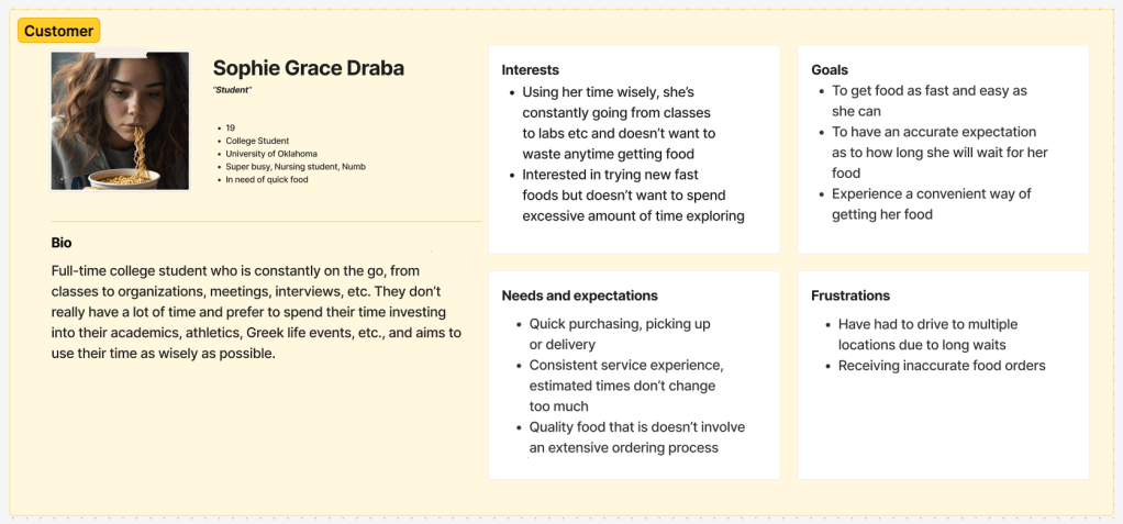
In this step in the design thinking process and to better understand the target user for the app, three different persona profiles were created. These profiles focused specifically on their interests, goals, expectations, and frustrations that where derived from user research that was conducted in the previous step. These profiles helped to define specific issues the app was going to solve.
From the user research, many of the interviewees best identified with the first persona, the customer, Sophie Grace Draba, claiming to be busy students that often order fast food, therefore making them a main target audience for the app. Sophie Grace serves as the app’s largest number of users, the customers, best identifying with a busy and fast-paced lifestyle where time is highly valued and not wasted. Users that fall under this persona are interested in trying new fast foods but not wanting to spend excessive amounts of time discovering restaurants. Their goals are to order and receive food in a time-efficient manor, to have a consistently accurate expectation as to how long the wait will be for the food, and to have an overall convenient ordering process.
3. Ideate
Read More
Out of many design ideas we came up with in the creative matrix in the initial ideation phase, we chose filtering and sorting feature, map and directions, and mobile delivery ordering to implement in the design of the app because it was made known through our user research that participants prioritize both food quality and efficiency over anything else.
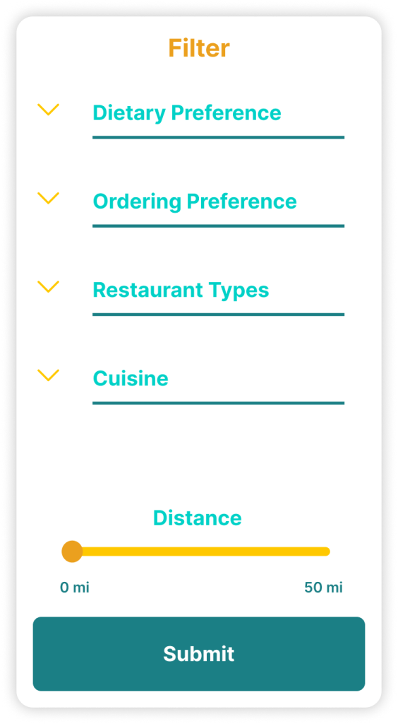
The first solution was derived from the question, “how might we increase accessibility to create an impactful design?” From this, the filtering and sorting feature was identified and integrated into the design plan. Through this use of organizing vast amounts of information about the restaurant and the varied wait times that were guaranteed to be displayed, the interface would be simpler and easier to use. This application explores personalization and communication with the user to be able to narrow down their preferences for an efficient way of discovering restaurants and accessing wait-time information.
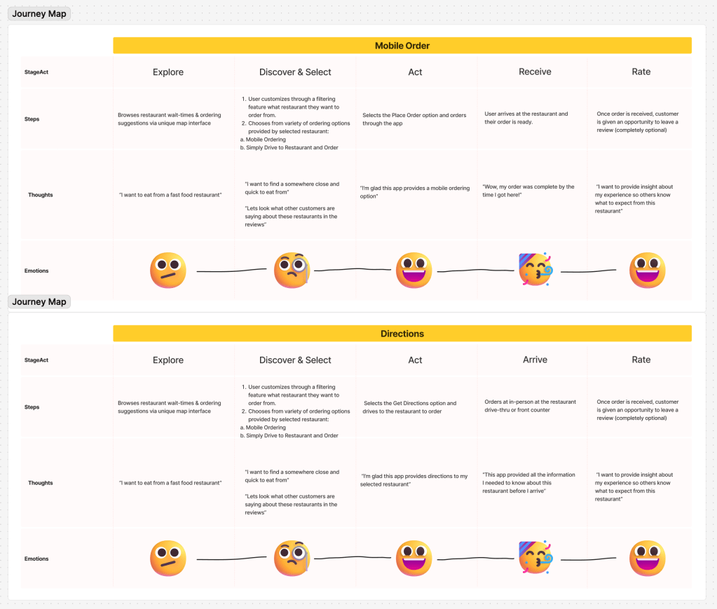
The second solution that the team decided would be valuable in the final product of the app was a map feature. Allow the user to be able to scroll and have an aerial view of surrounding restaurants or desired mile rage helped to improve accessibility and navigation. This solution was inspired from the HMW question, “how might we provide convenience to users through maps and navigation?” By prioritizing this solution, the app will be able to offer navigation and directions to its users for a different form of fast-food ordering, which is pickup, if preferred.
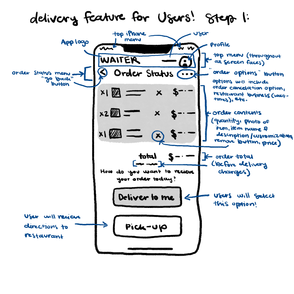
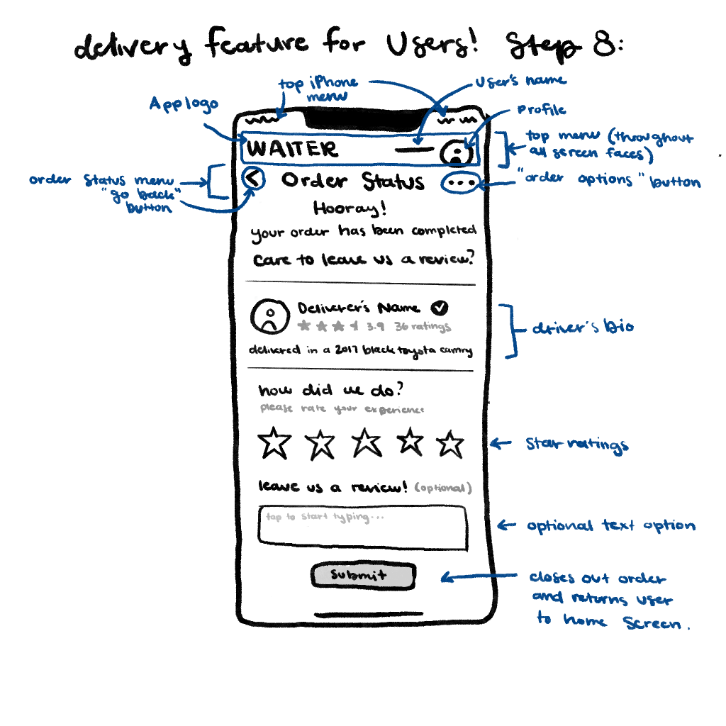
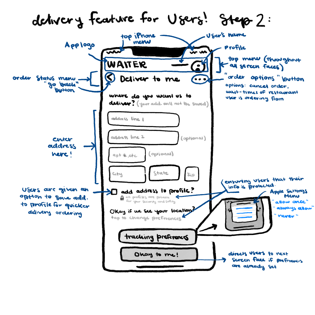
Lastly, the final solution that was prioritized in the app design was delivery featuring, which was inspired from this question, “how might we make users feel safe and protected when providing their location for delivery service?” By choosing to make users’ safety a superiority, the app proves that the customer’s welfare is important to the designers. This feature provides the user the ability to share location for an easier and efficient way of delivery (saving their location for following orders and avoiding repeated steps every time they order). Through this the delivery feature explores user preferences and convenience to ensure a positive experience every time the feature is in use.
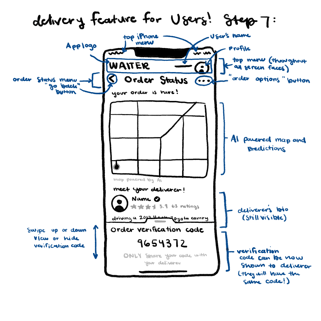
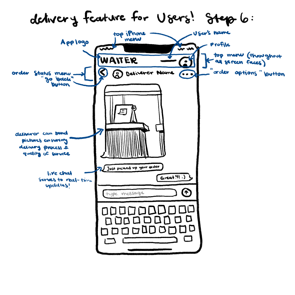
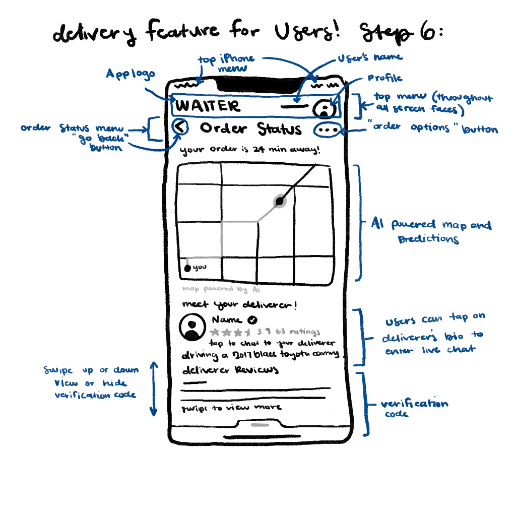
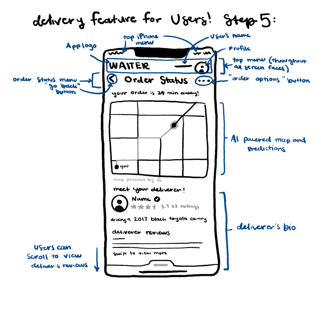
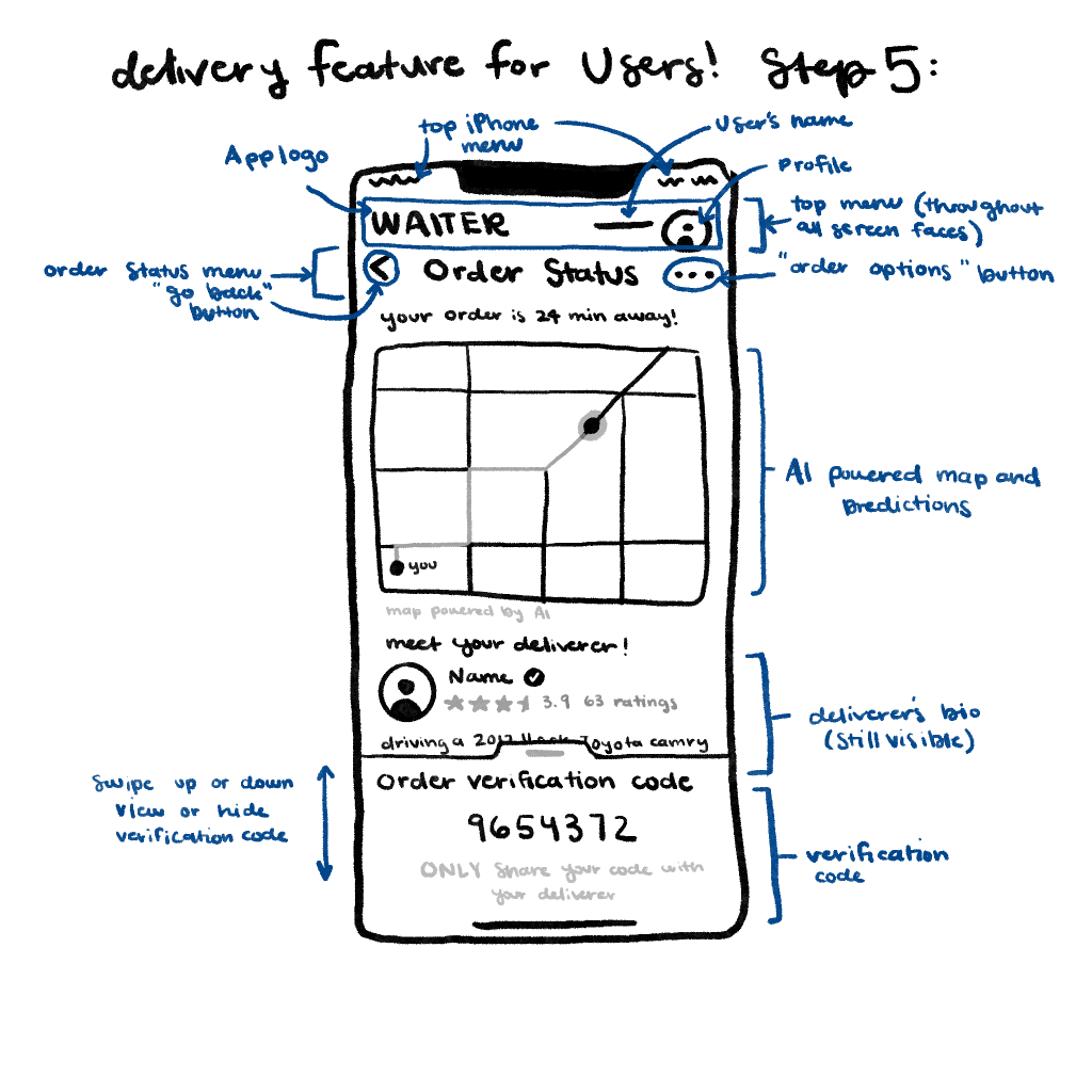
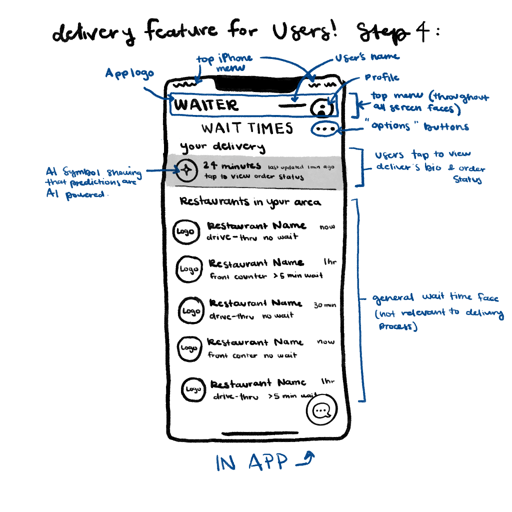
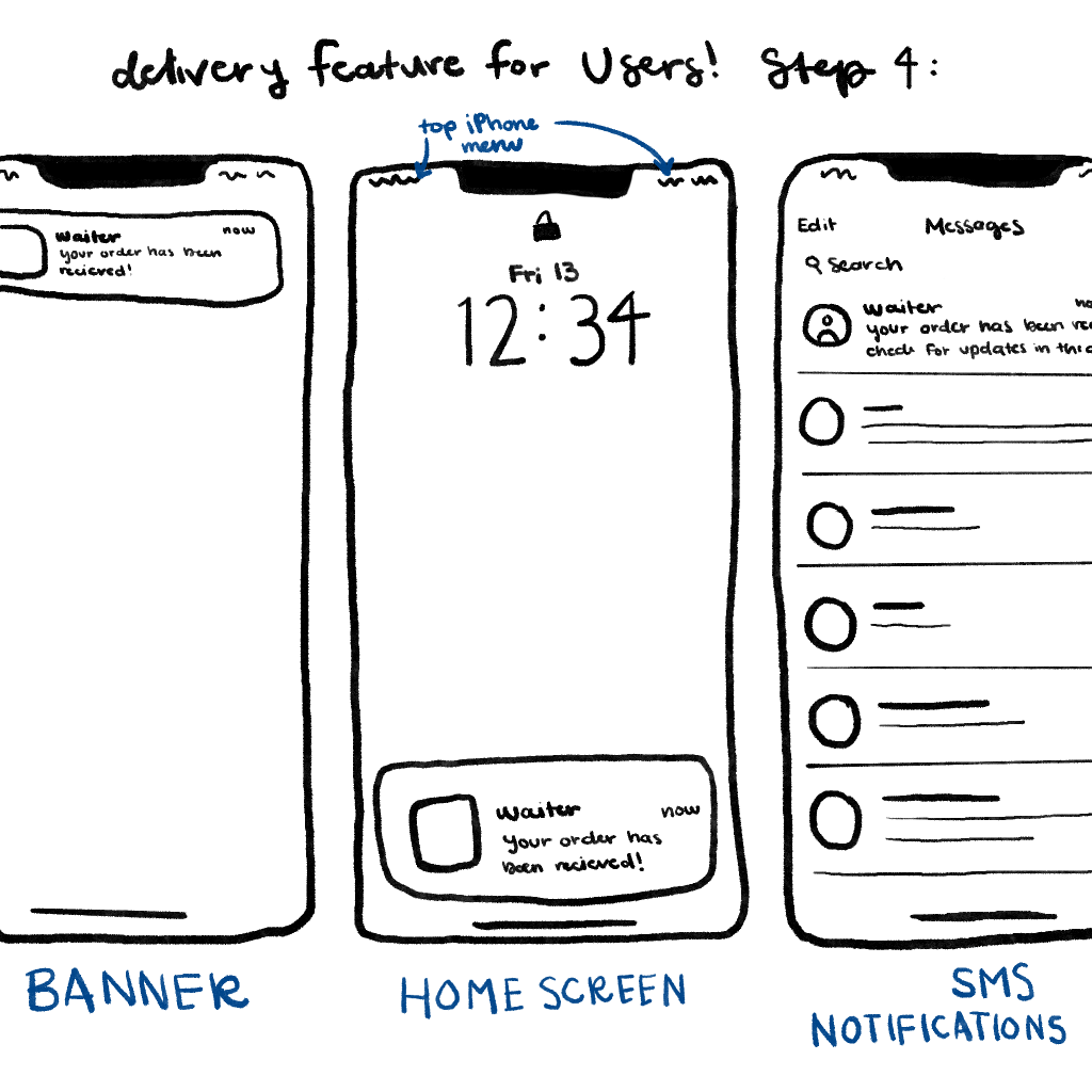
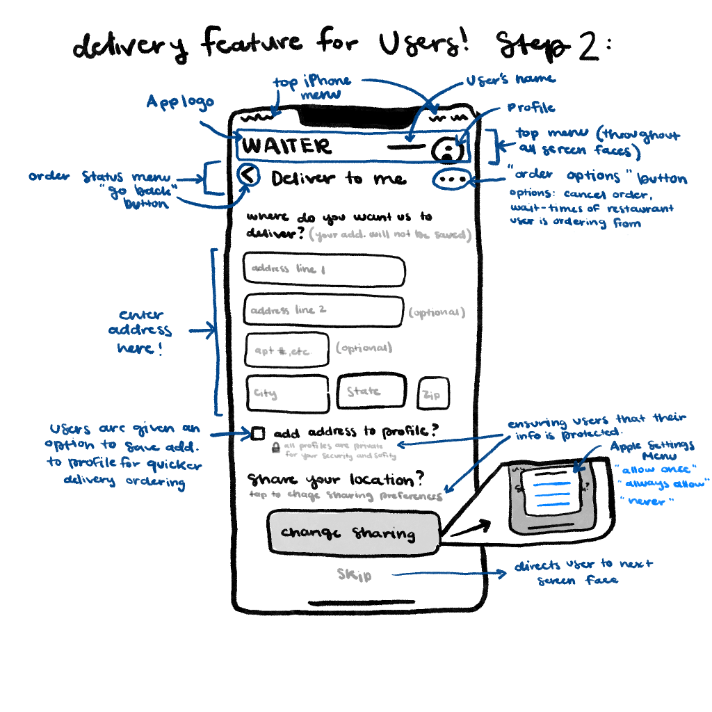
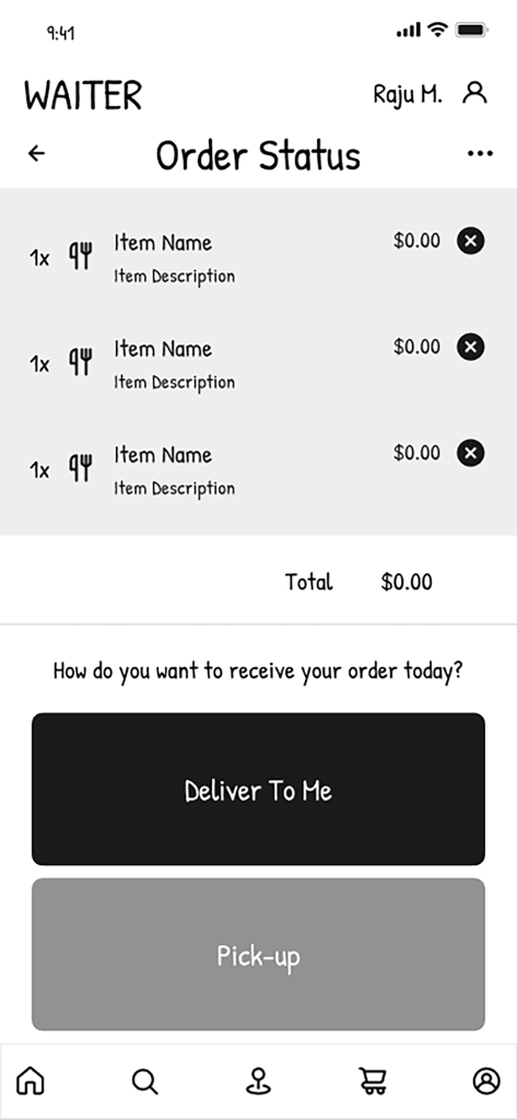
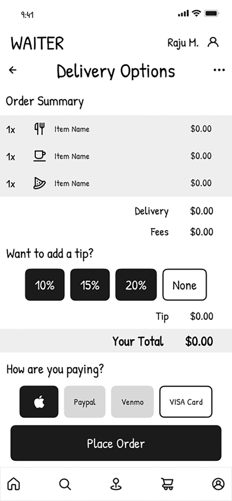
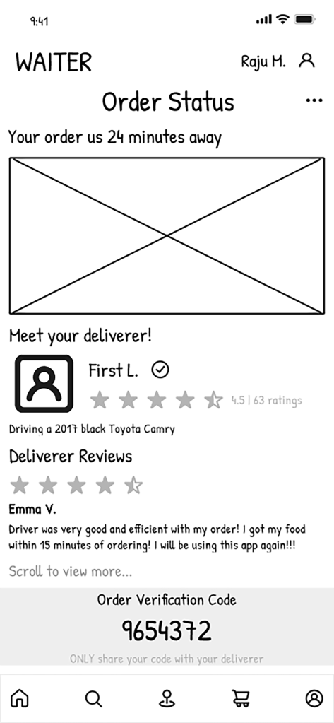
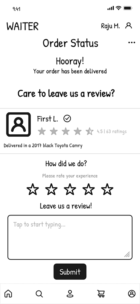
These are the initial exploration of the UI designs through sketches of the solutions identified in the previous step to best fulfill the explorations of each major feature. For the purpose of this individual report, my role was to implement the delivery feature to ensure both security and a smooth and effortless ordering system for the user from start to finish. First, I sketched out each page of the app, (8 sketches total) starting by requesting the user to input their delivery information and address, then asking to share location (exploring user preferences and customization), then to payment and completing the order, next to tracking the delivery’s progress and full transparency of the deliver (bio and all of their ratings), and then lastly to asking the user to leave the deliverer a review.


4. Lo-Fi Prototyping
Read More
We developed following wireframes based on the sketches for each feature. Templates were made with arrows to go back a page, a heading to clearly describe where the user was, and a bottom navigation bar to organize the features of the app helped form a clear and simple design. This part of the step was simple and didn’t require much because color was not yet a consideration which did serve to identify what feature was most important on each page.

5. Test (Cognitive Walk-Through)
Read More
Through evaluating the participants as they walked through the wireframes, it was found that the readability of the app was done quite well so far. The wireframes are clear and straightforward, leading to little to no issues during our cognitive walkthroughs.
During the walkthrough for filter and sort, it was noticeable how the participants easily located the buttons due to our use of the typical filter and sort icons. One participant made note about how they appreciated the buttons being one of the first things that appeared when loading up the app. The user then easily progressed through the action. Both participants informed that they would like to see an option to sort the restaurants by how close they were to the user’s current location. There was also a suggestion to remove the option to sort by lowest rated because the participant was unsure how often it would get used.
In the walkthrough of the app’s delivery feature, the observations concluded were that both participants had the same thought process. Both were used to seeing screens that asked for order confirmation, address information, and making payments before placing an order. One participant mentioned how they liked that the buttons were large, and the design was simple, making the ordering process enjoyable. After the order was placed, both participants were unsure what the action was between placing the order and receiving the delivery. They liked the idea of a map with real-time tracking, messaging the deliverer, and getting to look at their deliverer’s bio and past reviews while waiting for the order. When it came to the rate and review step, one participant suggested that they would’ve liked to see a skip option because not everyone has time to write a review. Overall, both participants said they enjoyed the delivery feature and its simplicity.
The participants for the map feature gave very similar ideas and insights. The main one being the use of color that will come in the following stages after wire framing. They mentioned how this will help them to navigate the icons and make certain buttons even easier to find. One participant even talked about making the icons for the home bar a little bigger. One also suggested a skip button for the feedback page in case the user does not have time to fill it out or desired to. The participants provided helpful feedback to apply to the final design of the app’s features. Because of this, it will lead to an easier design process because of a deeper understanding of user’s design preferences. Because of this, the team can meet the few pain points that were identified in the cognitive walkthroughs.
6. Hi-FI Prototyping
Read More
The wireframes were then further developed into interactive prototype. One significant assist was now the use of color and its impact on the design. As a team, it was deiced to create a pallet that both separated from mobile ordering service designs yet complement traditional fast food industry logos. The psychology behind the colors also informed the color palette, blue implies trust (security and authenticity of information), and yellow is associated with energy and happiness (reinforcing the solution’s goal of providing efficiency and convenience).
In this process, the team also collaboratively organized the Figma workspace through following Atomic design. Other important design decisions were the fundamentals of interaction design which included visibility consistency mapping feedback constraints simplicity and flexibility. Easy navigation throughout the app was a top priority along with creating a design that made sense for the viewer to navigate from the filtering and sorting feature to the map feature, then to the delivery and ordering system.
7. Test (Heuristic Evaluation)
Read More
In the testing process of our app, the use of the heuristic evaluation from peers’ students served to provide an outward perspective of the app’s design and how to develop and integrate their solutions into our final design. Many of our users had a problem navigating to pages that had no escape. A few of the prototypes did not transfer over from our original Figma file and caused a couple broken parts and lack of consistency, which conflicted with Heuristic 1. Processing pages, prototyping and navigation (ex. back arrows), consolidated pages with overlays, and clarification on wait times.
Final Prototype
The wireframes were then further developed into an
interactive prototype.


Conclusion & Reflection
I found that my role contributed the most to the design and visual identity of this app. I was able to create a design that was cohesive between all features Able to create a smooth flow for the users and provide a logo that is easily understood as both a navigational and a time efficiency focused service to users.
My contributions also served to help provide research when it came to interviewing and evaluating fellow peers end users in regard to bettering the app. I found it best within Figma to use the basic and already available characters in other available resources to create buttons and icons. The use of ChatGPT did help in our formative research stage when we were discovering how we were going to develop an app and although we did use ChatGPT in our assignments we did our best to allow the thinking to be my own. ChatGPT did help inspire and provoke deeper thinking, yet it did not do the thinking for me.
At the beginning of this assignment, I learned that it was difficult to collaborate and hard to communicate ideas when you had a specific vision in mind. I learned from this team that it is important to communicate and take the time to allow your other team members to understand your thoughts. They also have thoughts of their own and it is hard to express too. From this, I’m able to approach classes differently when working in group projects and understanding that we are all coming together and trying to understand each other too. Once we did and took the time collaborate and share ideas effectively, we were better able to follow through with the final designing process thus creating an app back and accurately inform a customer of wait times, direct them from one location to another, and to create a smooth and efficient ordering process from start to finish. I’m very thankful for the opportunities that I’ve had in this class and learned so much about how to be a contributing team member.
