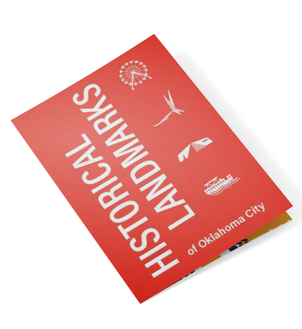
The Oklahoma City Landmark Symbol System is a visual identity project created to represent the city’s most notable landmarks through cohesive and meaningful iconography. Designed for use across signage, maps, and digital applications, the system enhances local engagement and promotes awareness of OKC’s rich architectural and cultural heritage.
Problem
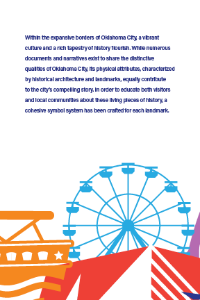
Oklahoma City lacked a unified visual system to communicate the identity and significance of its landmarks.
Objective
Designing a set of symbols that accurately reflected each landmark’s unique history while maintaining visual consistency and scalability across various media required extensive research and thoughtful execution.
Solution
I developed a cohesive symbol system that blends simplicity with detail, balancing historical accuracy and creative expression. The resulting icons function seamlessly across both print and digital platforms, creating an informative and visually engaging guide to the city’s architectural and cultural identity.
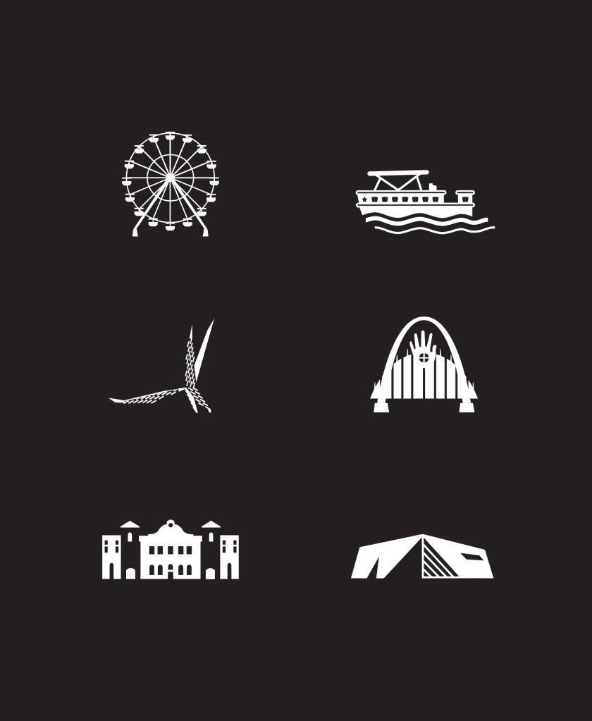
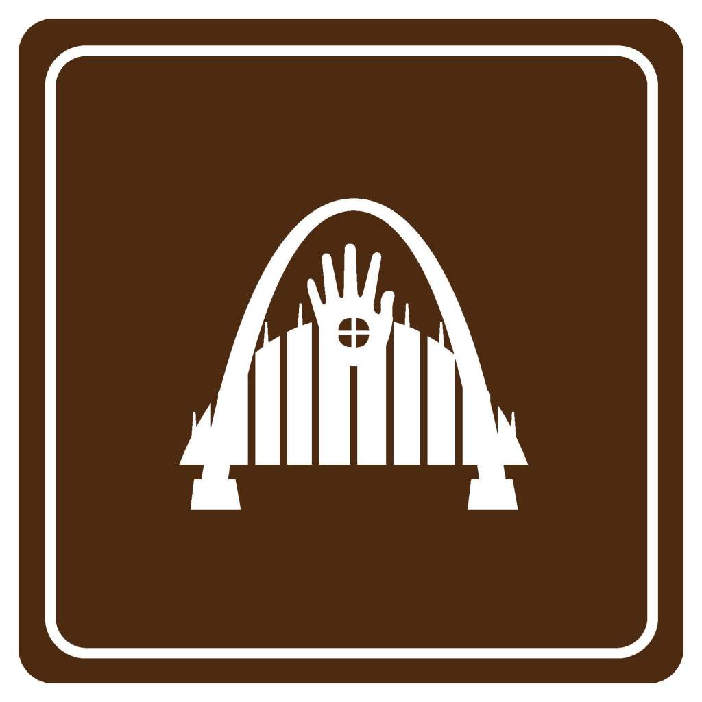
Project Research
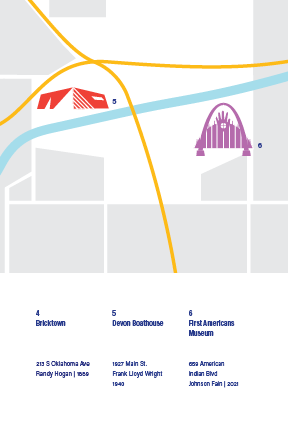
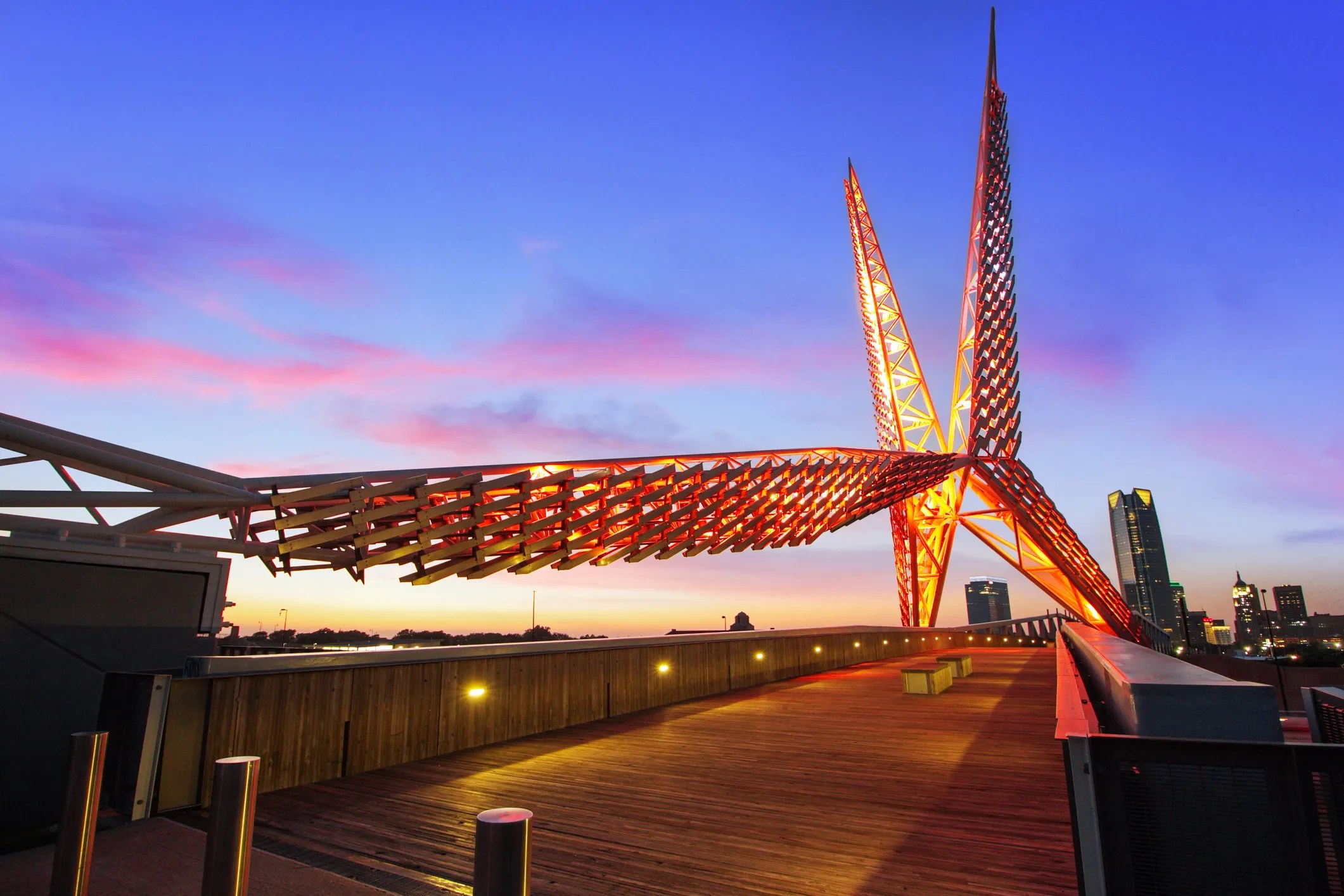
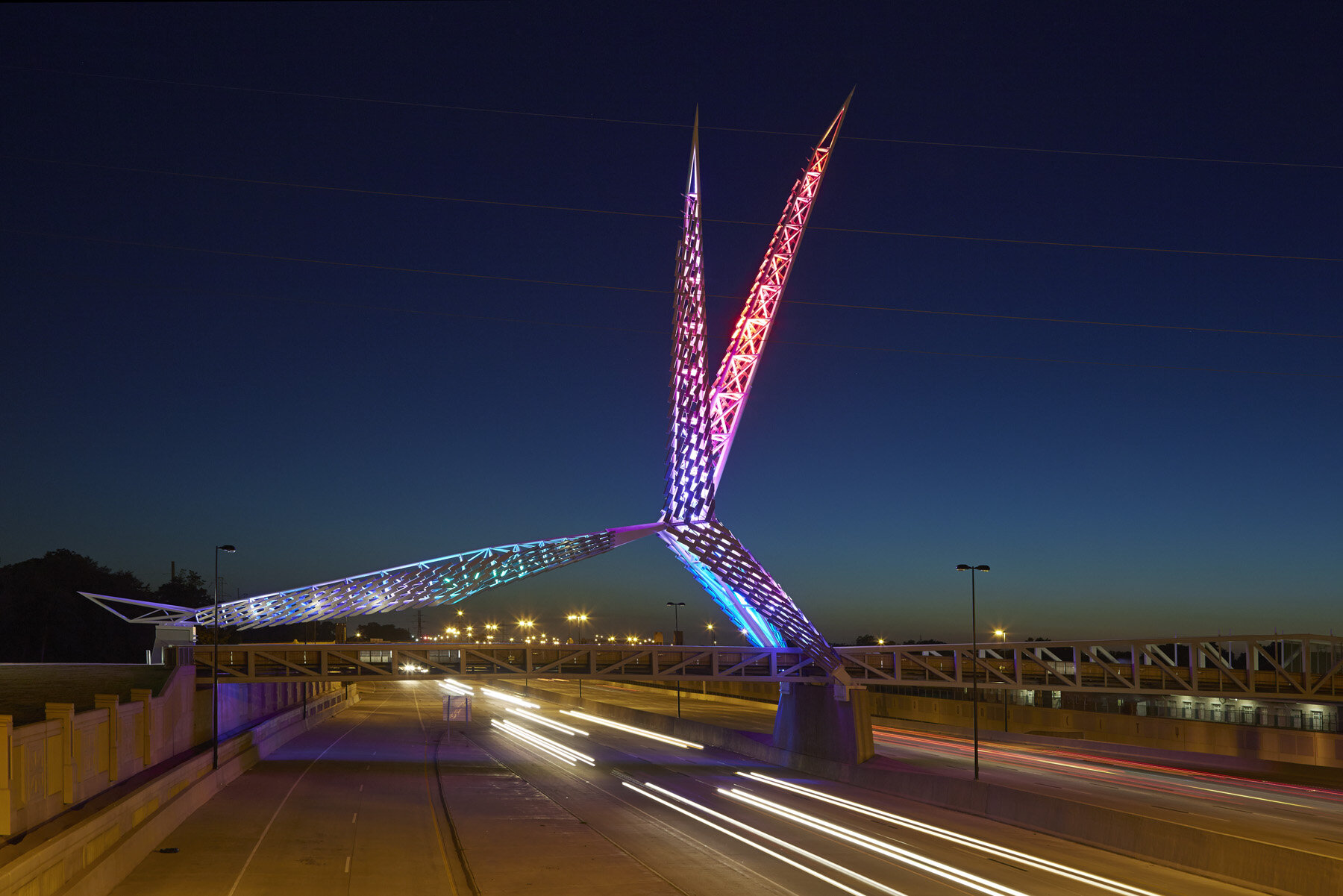
SkyDance Bridge in Scissortail Park
I-40 and Robinson Ave S. • 2012
The landmark acknowledges the key aspects of Oklahoma from its vast natural beauty, prosperity, and achievements, and to the developments of Braniff airlines and the Tinker Air Force Base. Hans E. and Torrey Butzer pulled inspiration from the mating dance of Oklahoma’s state bird, the scissor-tailed flycatcher. The bird’s scissor-like tail represents the necessity to navigate the swirling prairie wind. The bridge is held with durable construction materials such as a steel hybrid structure and strengthened with hollowed bones.
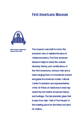
First Americans Museum
659 American Indian Blvd • 2021
The museum was built to honor the ancestors who in habited the land of Oklahoma before. The First American Museum helps to share the cultural diversity, history, and contributions of the First Americans. Johnson Fain and a wide-ranging team of consultants worked alongside the American Indian Cultural Center Foundation and representatives of the 39 Tribes of Oklahoma to best represent the rich Native American history and heritage. The tall prismatic glass that is seen from afar, “Hall of The People” is the meeting place for the tribes and start for visitors.
Wheeler Ferris Wheel
Wheeler District 1701 S Western Ave • 2016
The fairground ride’s origin began at the Santa Monica Pier and was purchased in 2008 on eBay by developer Grant Humphreys and was refurbished in Oklahoma City. The Wheeler Ferris Wheel is a representation the growing community in Oklahoma City that offers amenities that provide convince and quality to Oklahoma’s dynamic core.
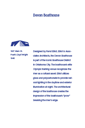
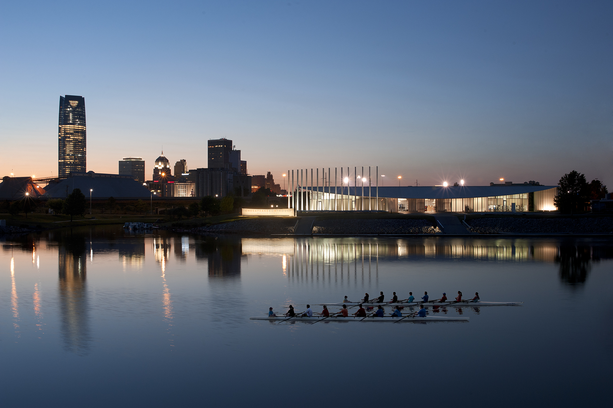
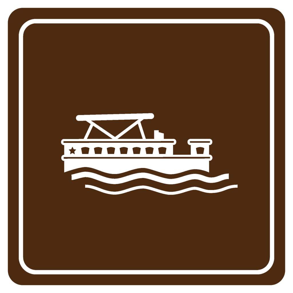
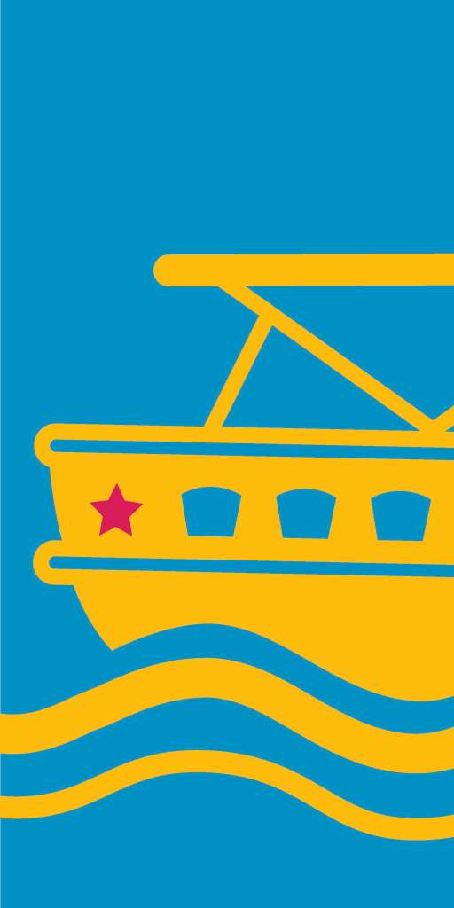
OKC Boathouse District
608 Riversport Dr • 2010
Designed by Rand Elliot, Elliot & Associates Architects, the Devon Boathouse is part of the iconic Boathouse District in Oklahoma City. The boathouse’s elite Olympic training venue recognizes the river as a cultural asset. Elliot utilizes glass and polycarbonate to provide natural lighting in the daytime and exterior illumination at night. The architectural design of the boathouse creates the impression of the boathouse’s “prow” breaking the river’s edge.
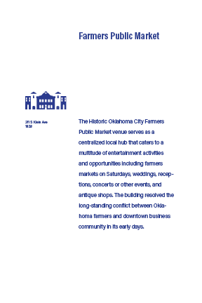
OKC Farmers Public Market
311 S Klein Ave • 1928
The Historic Oklahoma City Farmers Public Market venue serves as a centralized local hub that caters to a multitude of entertainment activities and opportunities including farmers markets on Saturdays, weddings and receptions, concerts and events, and antique shops. The building resolved the long-standing conflict between Oklahoma farmers and downtown business community in its early days.
Lower Bricktown
213 S Oklahoma Ave • 1889
The revitalization and continuous development of Bricktown represents the growth and prosperity of Oklahoma City from its crime ridden and dilapidated origin. Developer Randy Hogan, took on the project of making Oklahoma City “fun” and serving as a central place of entertainment and unique community. Bricktown was, and still is, a central hub connecting not only railroads and highways, but local citizens and visitors.
Developing an Identity
Color Palette
The color palette draws inspiration from Oklahoma City’s urban and natural landscape — warm brick tones, muted blues, and earthy neutrals reflect the city’s blend of industrial heritage and open skies. These colors establish visual consistency across all applications, ensuring the symbol system feels both modern and distinctly local.

Process Sketches
The design phase featured multiple rounds of hand-drawn sketches exploring form, motif and symbolism — translating landmark characteristics into simplified visual elements. These iterations allowed for refining scale, line weight, and metaphor to ensure each icon felt both distinctive and part of a unified system.


Deliverables
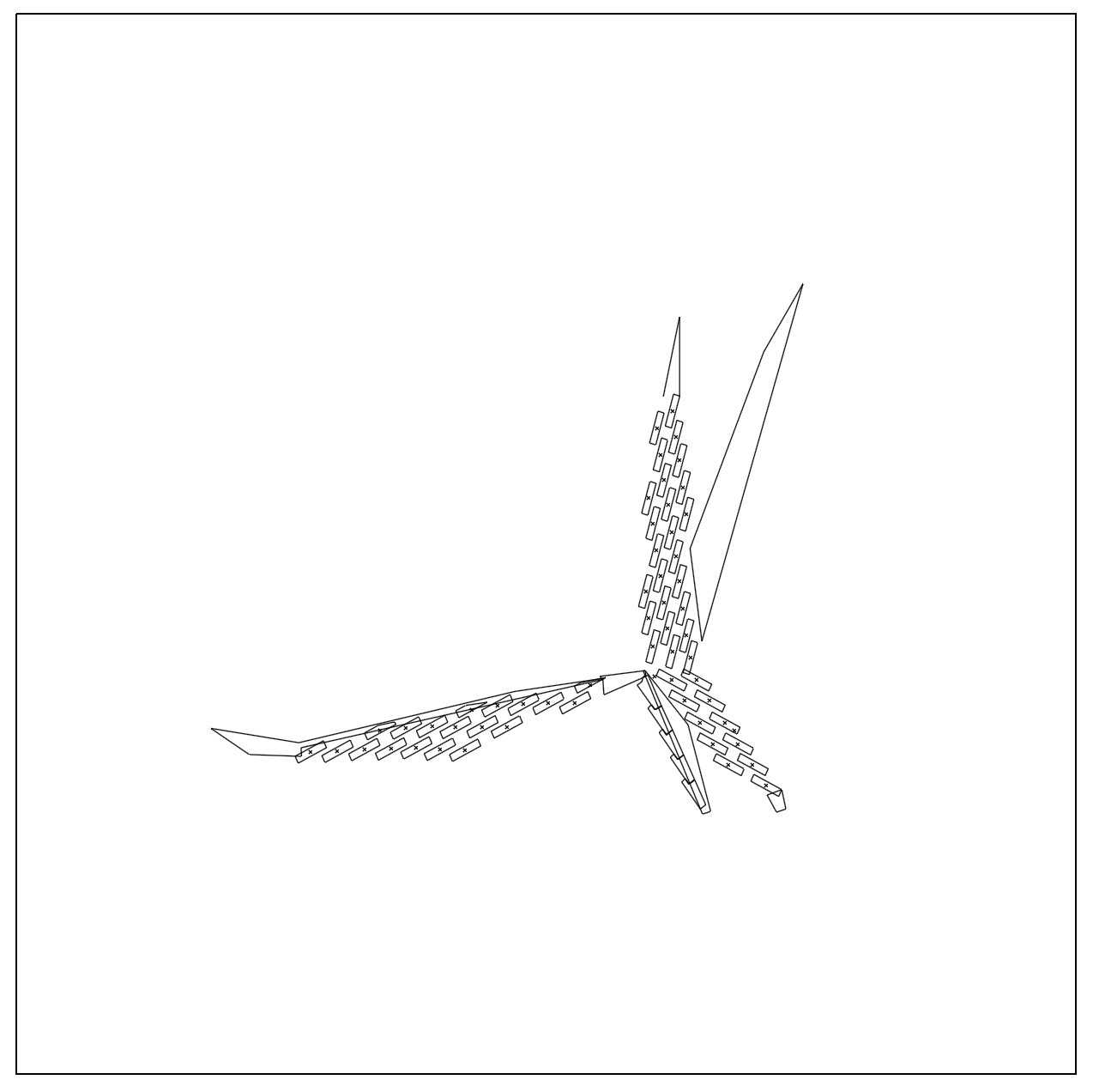
Symbol Translations
Once sketches were selected, each symbol was digitized and refined, converting the hand-drawn ideas into vector icons. Consistent strokes, alignment and proportions ensured visual harmony across the set, enabling each landmark’s identity to be conveyed clearly while maintaining system cohesion. Below is the ODOT deliverable using the digitized symbols.


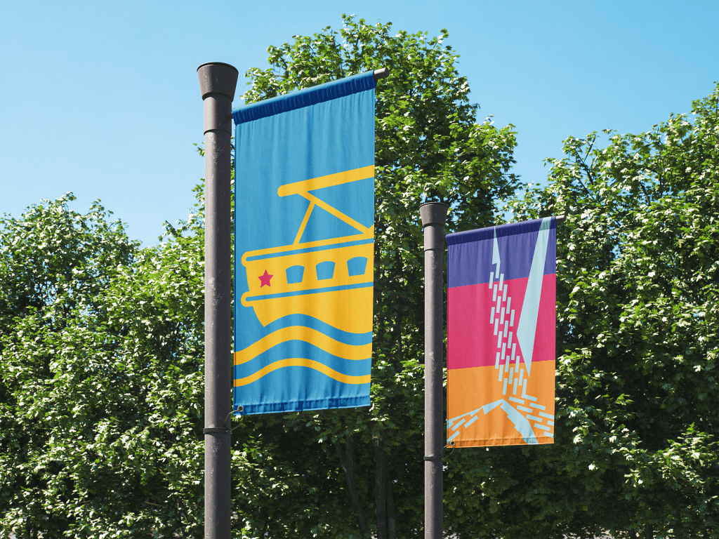
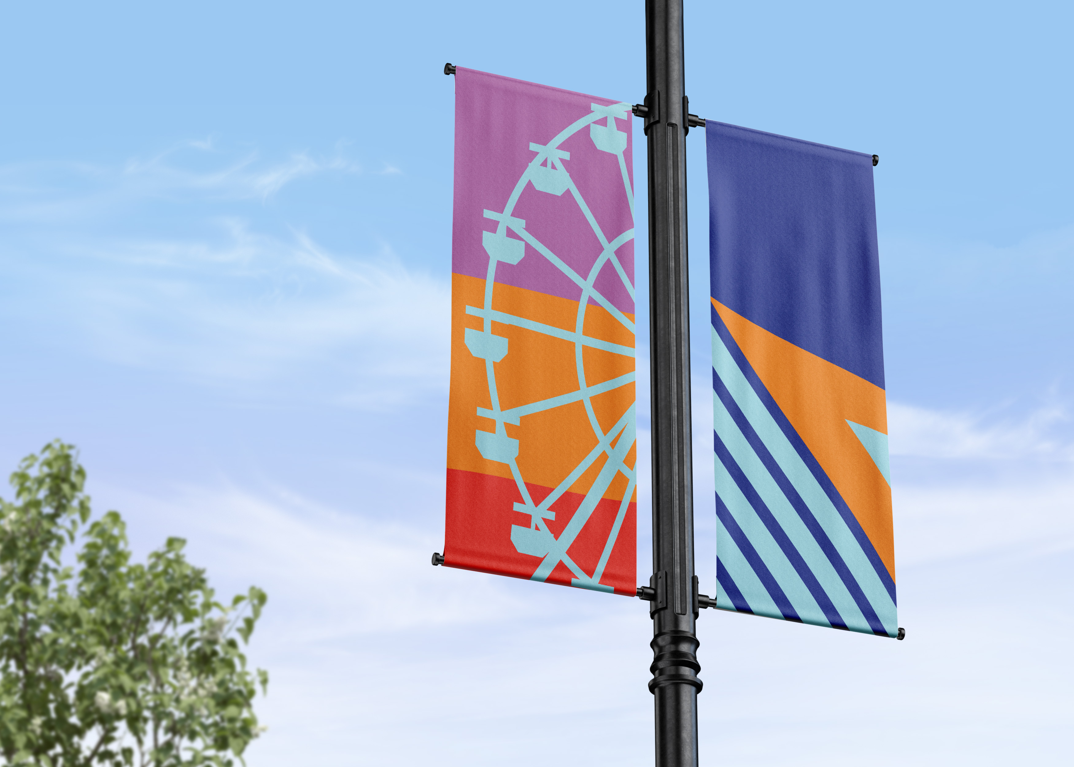
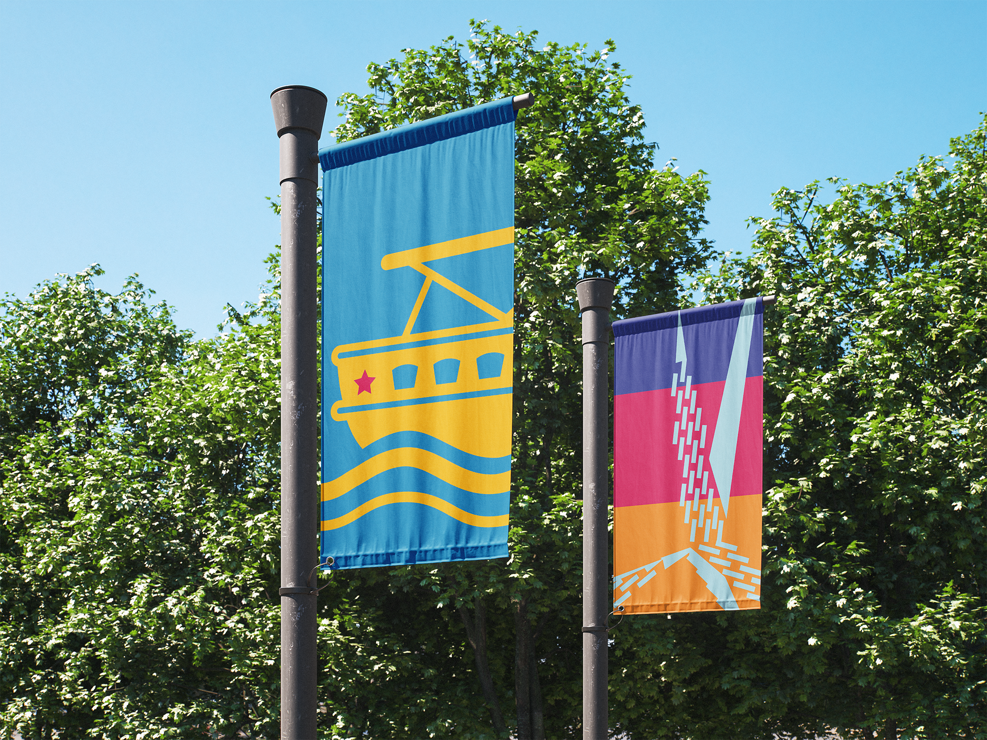
Banner Design
The icon set was applied to street-pole banners to showcase real-world implementation. Designs included vertical formats, color variations, and placement studies to ensure readability, brand presence, and contextual fit within urban settings (day/night, varied backgrounds).


Beyond the core icons and banners, supplementary applications were developed:
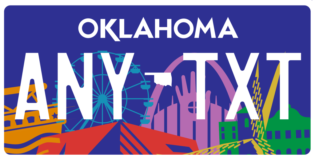
- A custom licence-plate design pulling thematic elements from the symbol system.
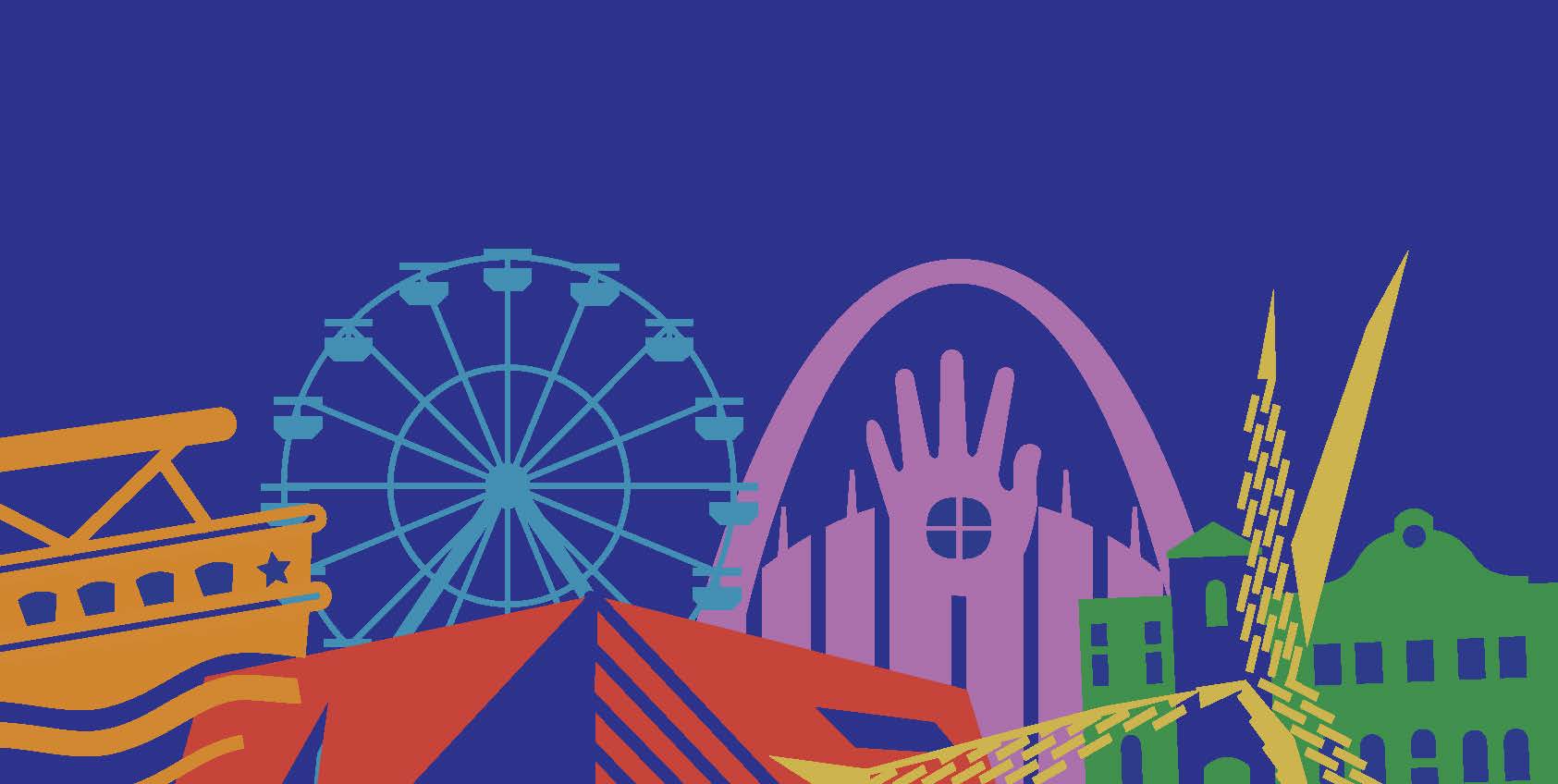
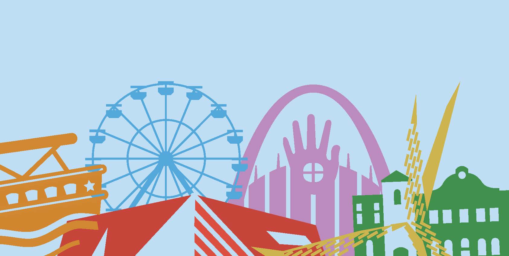
- Skyline variant graphics that integrate landmark icons into a cityscape silhouette.
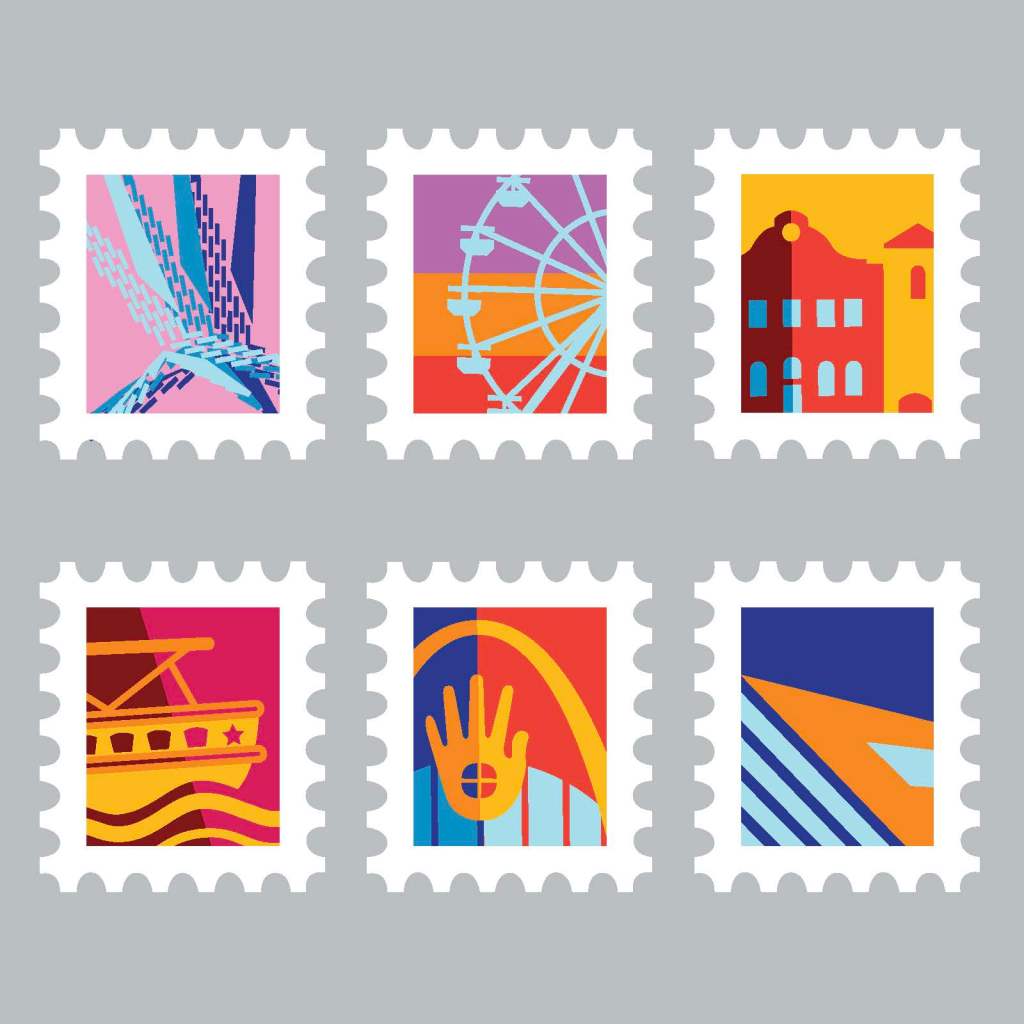
- A postage-stamp series to highlight individual landmark identities in miniature form.
- A book compiling the landmark research, symbols and design rationale — serving both as a reference and a promotional artifact.