A print magazine dedicated to showcasing revitalized architectural spaces worldwide. It highlights how neglected or underused urban areas are transformed into thriving, functional environments that inspire communities. Through its clean, modern typographic design, grid-based layouts, and earthy color palette, the magazine mirrors the balance of aesthetics and purpose found in revitalized architecture.
Project Summary
Urban Uplift is a print magazine I created to highlight the beauty and purpose of revitalized architecture. It explores how neglected urban spaces can be transformed into vibrant, functional areas that bring communities together.
Every detail of the magazine, from its textured cover to the clean, grid-based layouts, was designed to reflect the care and creativity behind these transformations. The typography and visuals work together to tell the story of renewal, emphasizing the balance between aesthetics and functionality. Through Urban Uplift, I wanted to inspire others to see the potential in overlooked spaces and appreciate the power of design to shape our world.
Process
Concept Development
Revitalized architecture immediately stood out to me as a theme that reflects creativity, purpose, and a sense of renewal. I wanted to design a magazine that captured these elements while staying visually engaging.
Research
To build the magazine’s content, I researched for revitalized spaces worldwide and the cultural significance and the design choices that made these projects successful. I also looked at other architectural magazines to create a compelling visual and narrative foundation that combined typographical elements with the chosen locations architectural aesthetics.
Content Curation
I carefully selected photography and articles that highlighted the transformation of these spaces. Every piece of content was chosen to emphasize the human and community impact of architectural renewal.
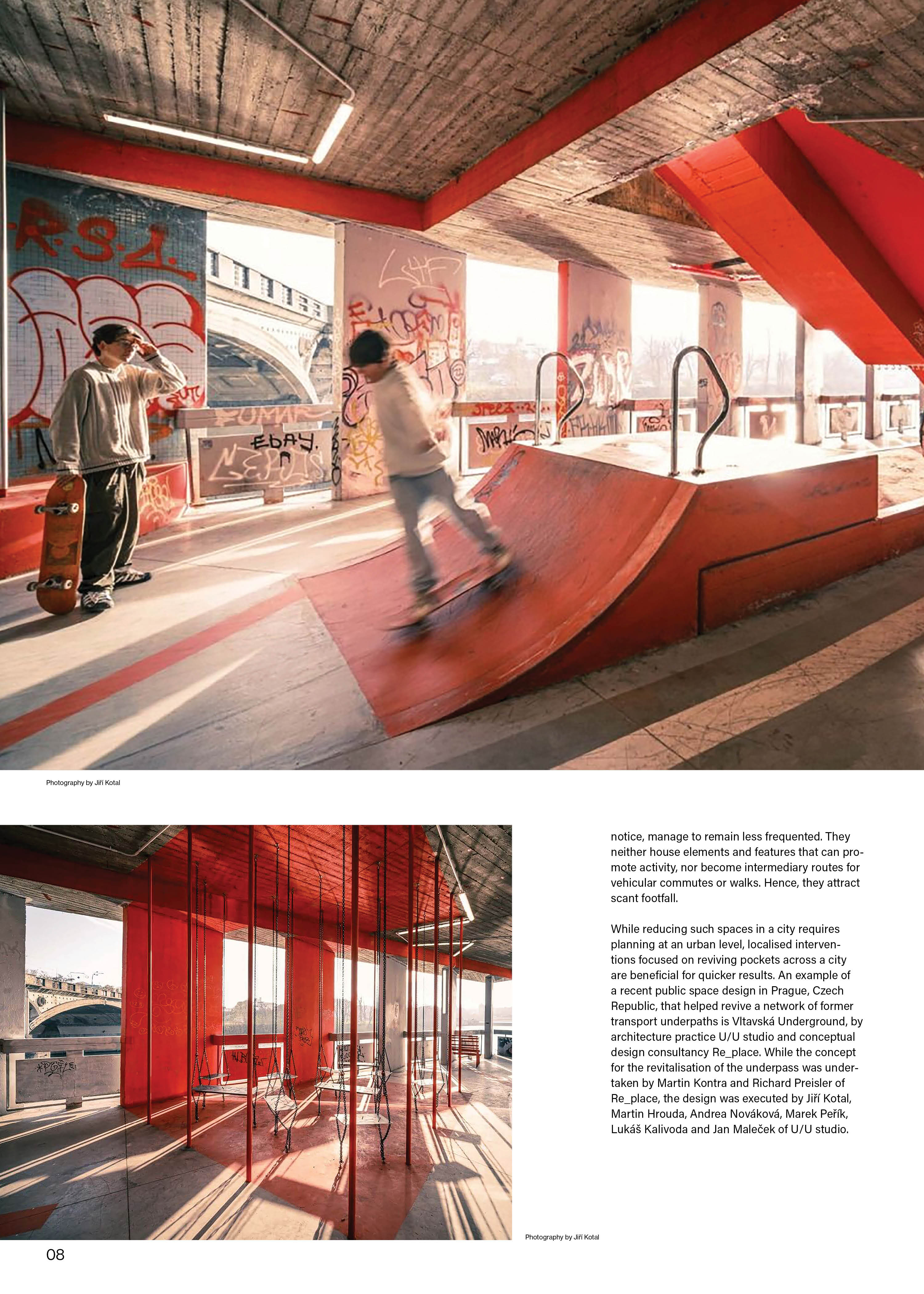
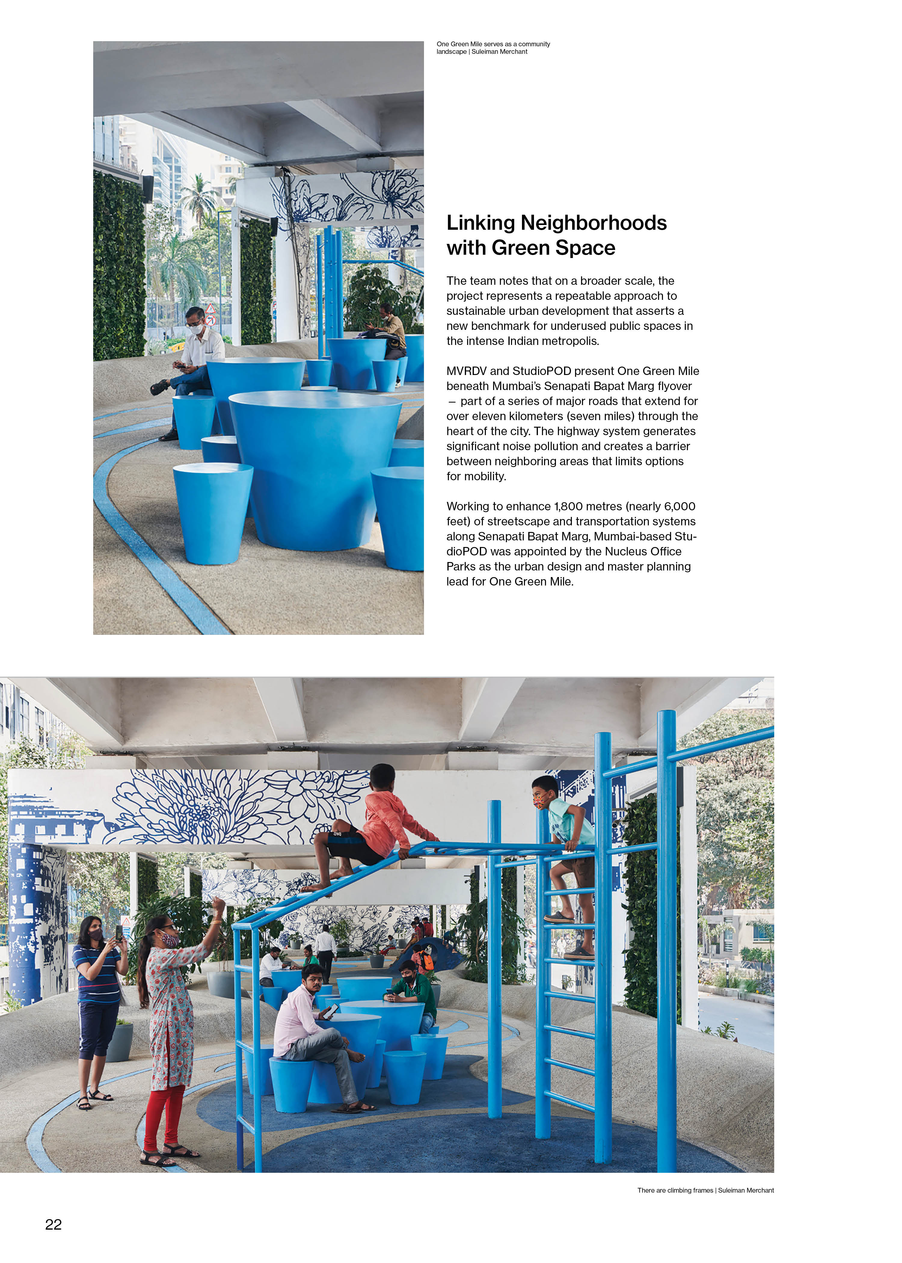
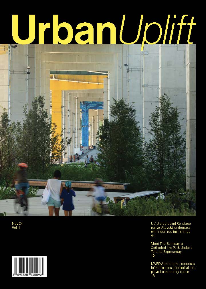
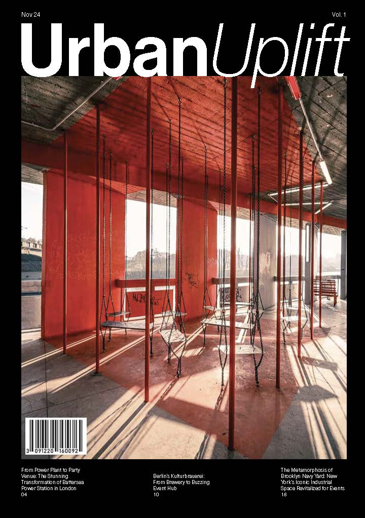
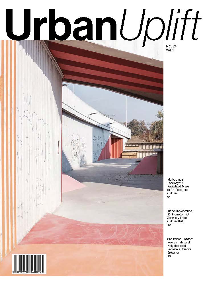
For each of the three articles in this feature, I selected three renovation projects that focused solely on the spaces underneath highway overpasses. This transformation of unused and normally overlooked space was the invitation for communities to enjoy public spaces in unity while also celebrating the places in which they live.
Article 1:
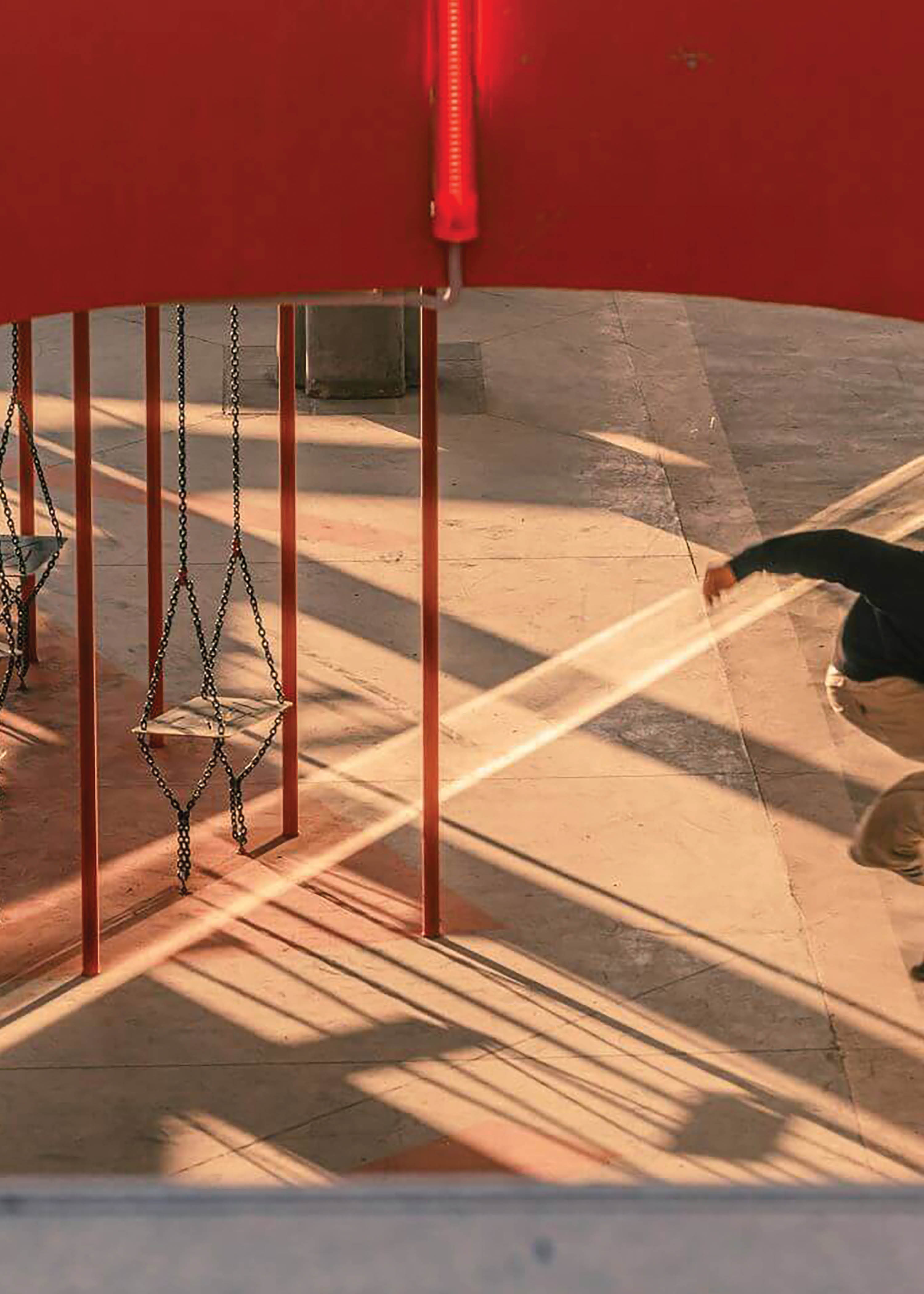
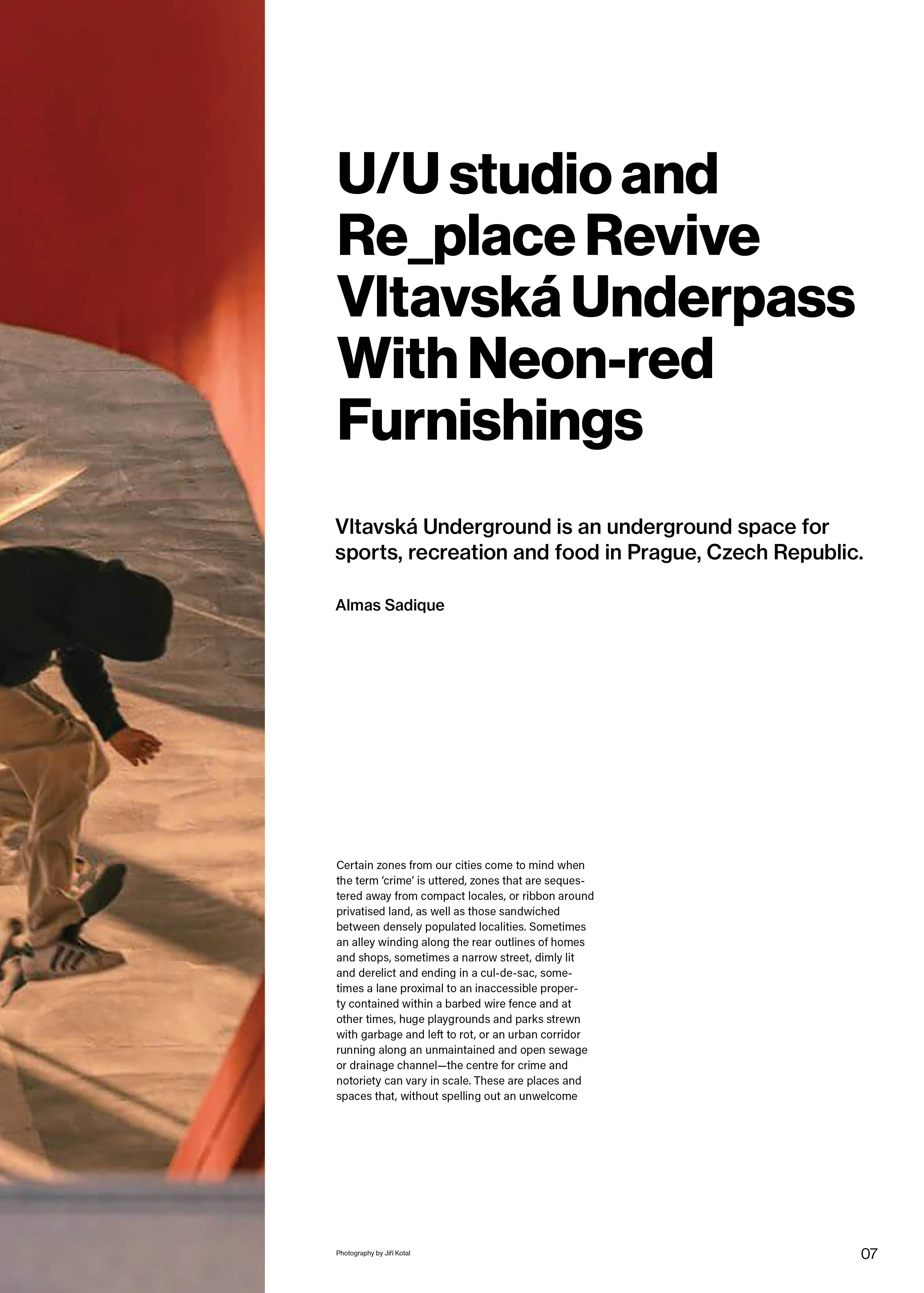
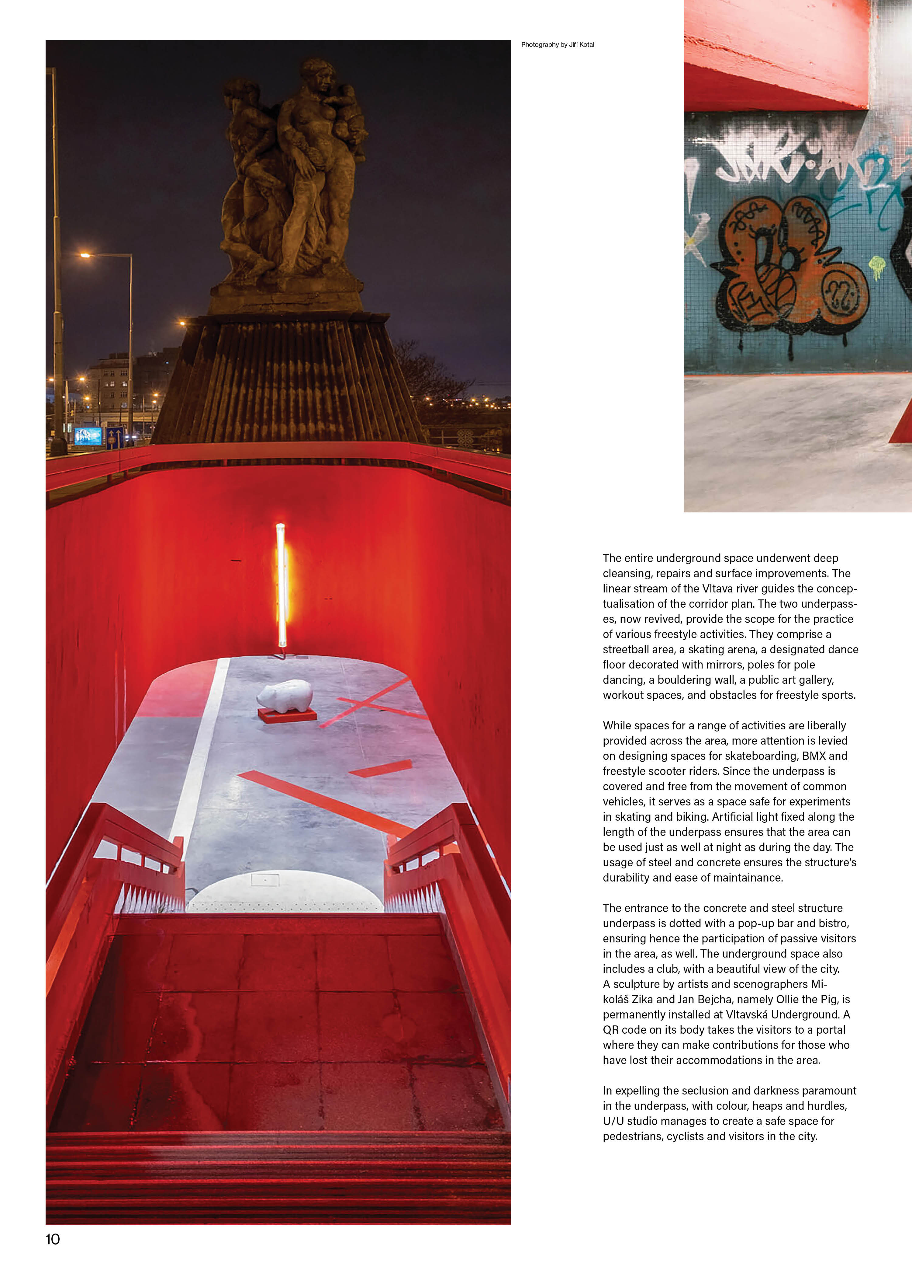
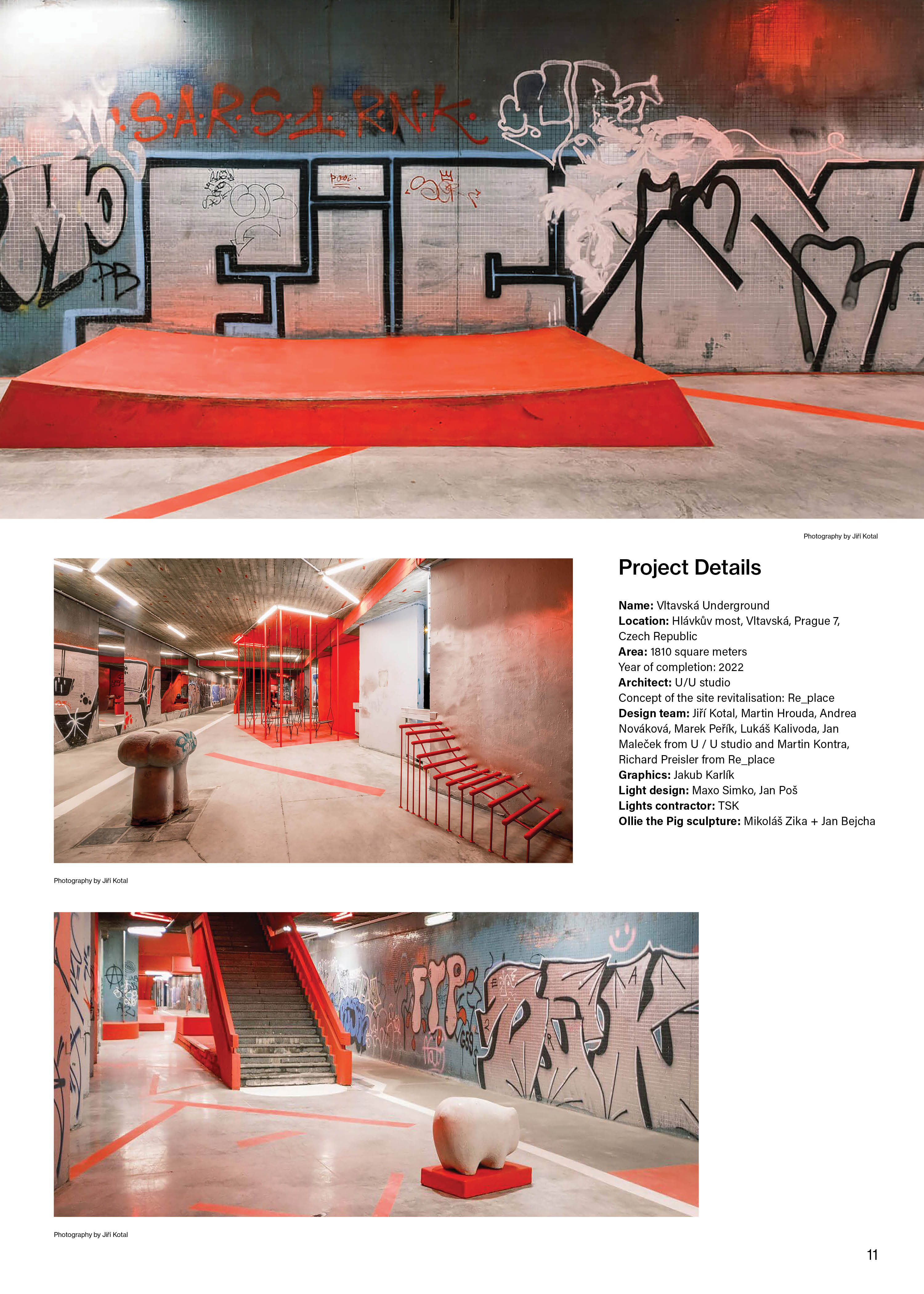
U / U studio and Re_place revive Vltavská underpass with
neon-red furnishings
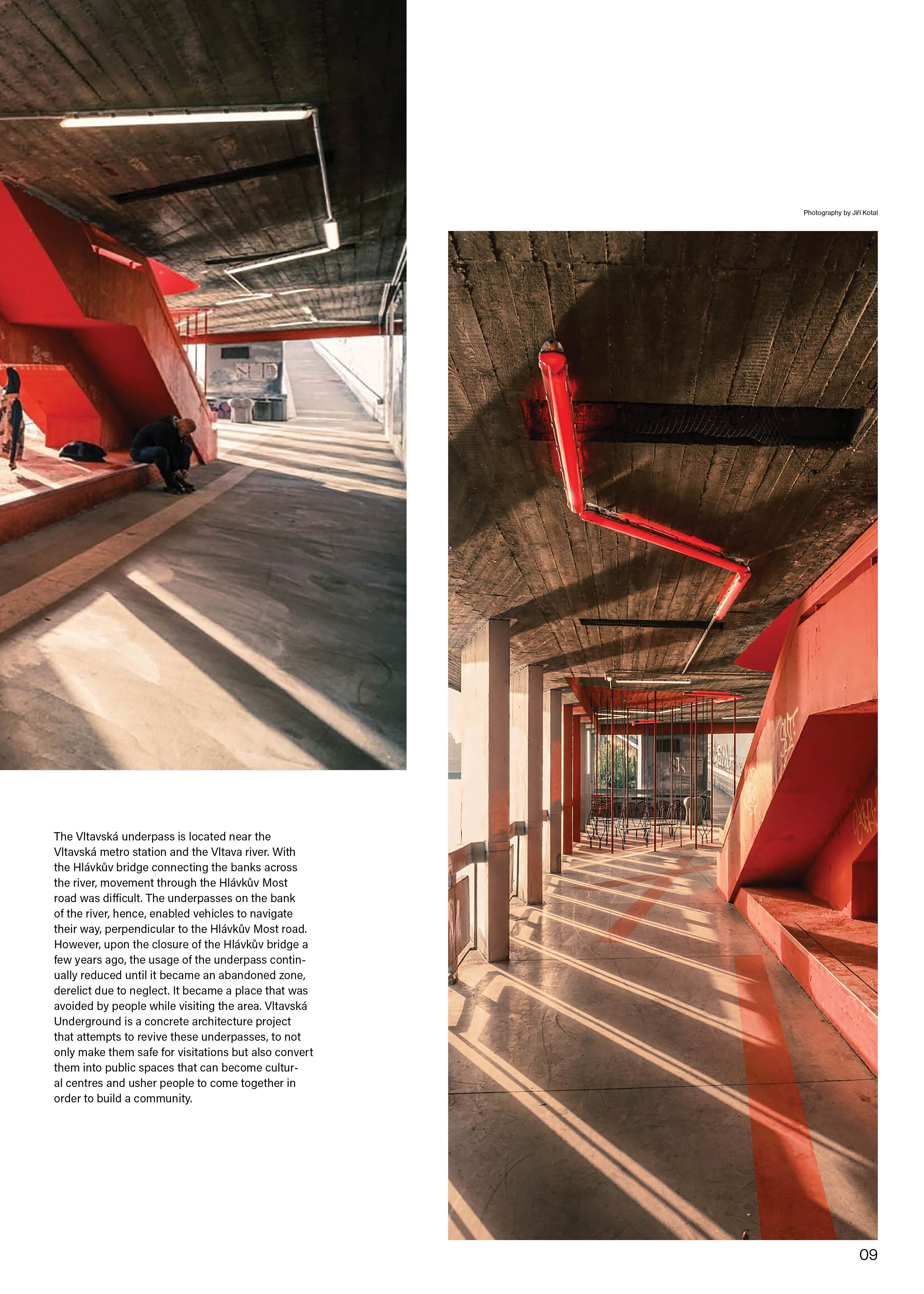
Project located in Prague, Czech Republic
Article 2:
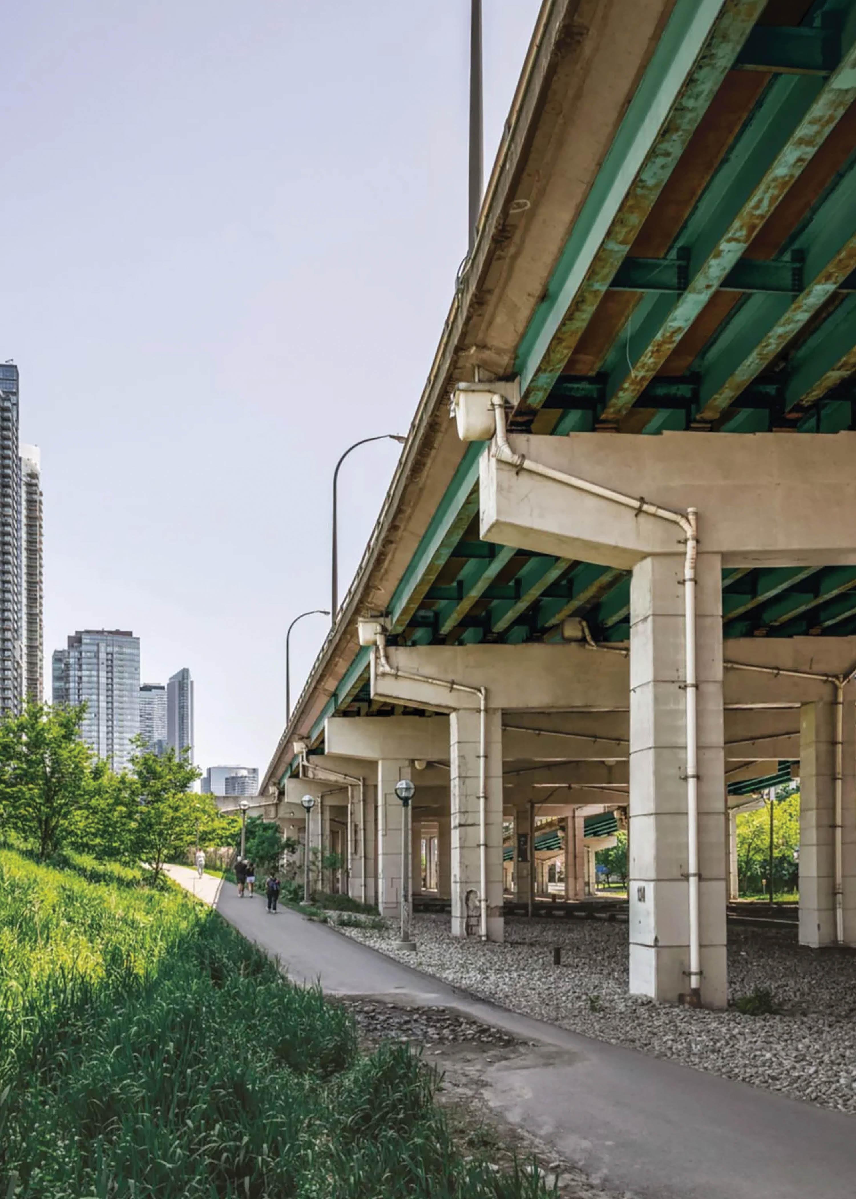
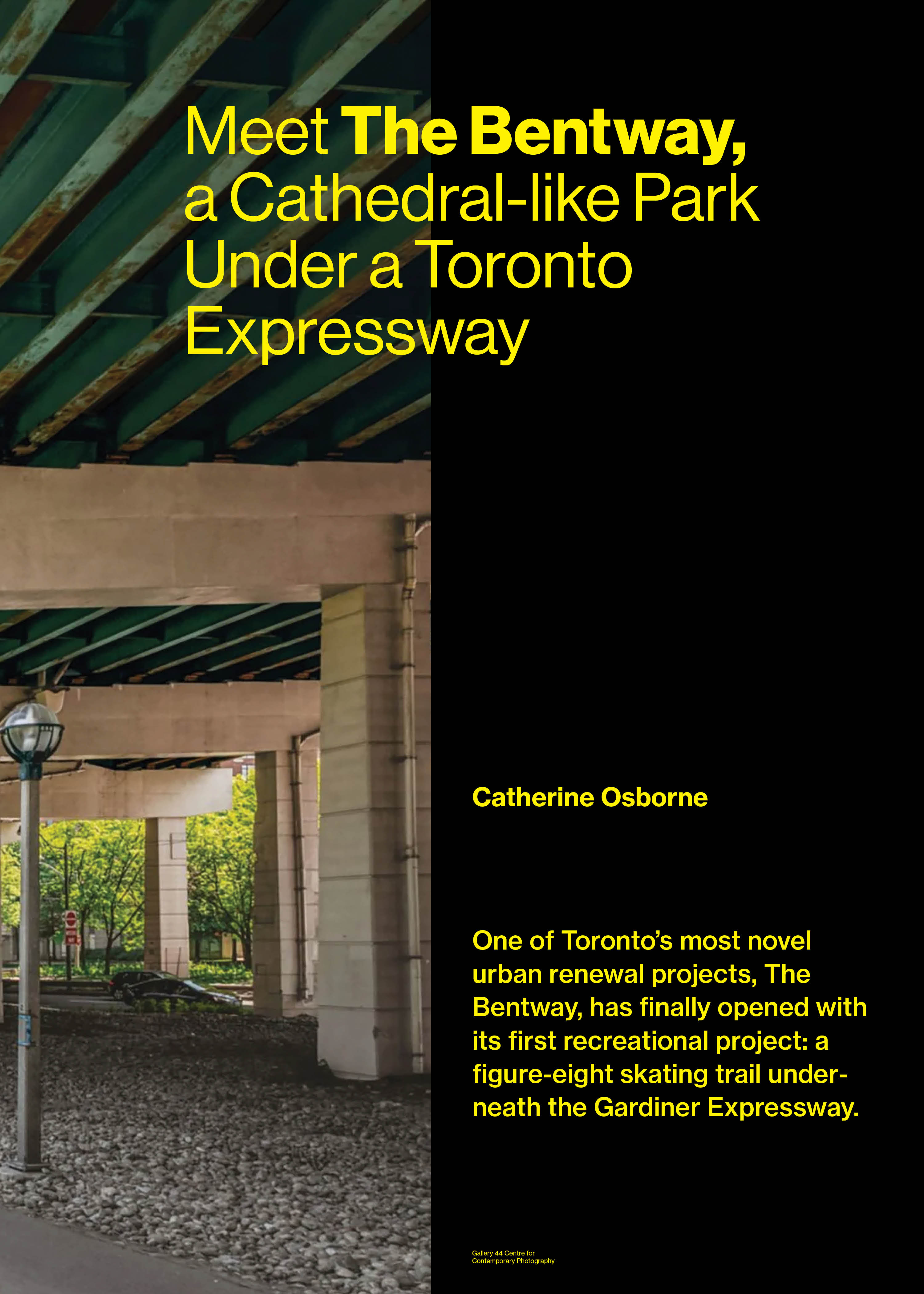
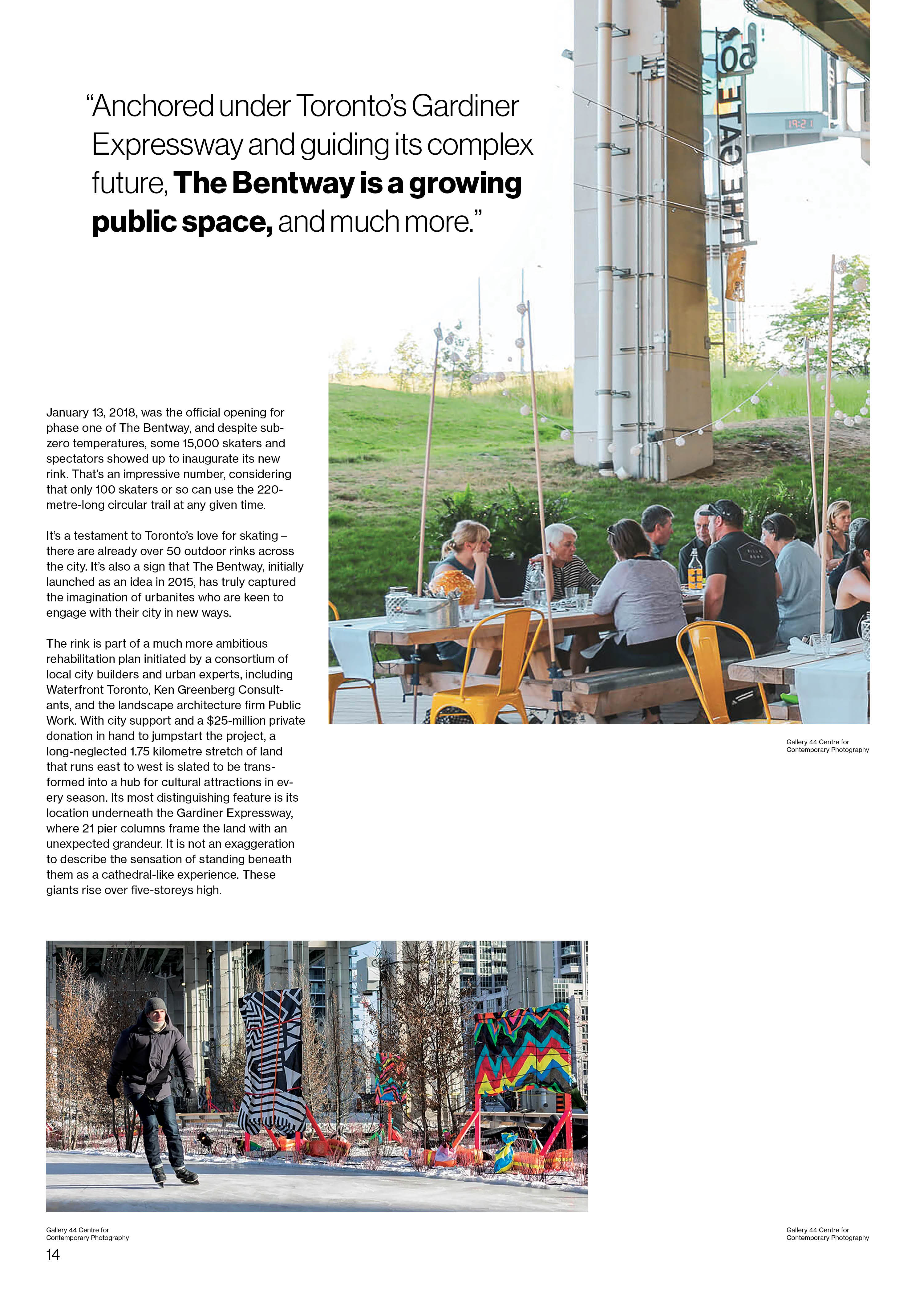
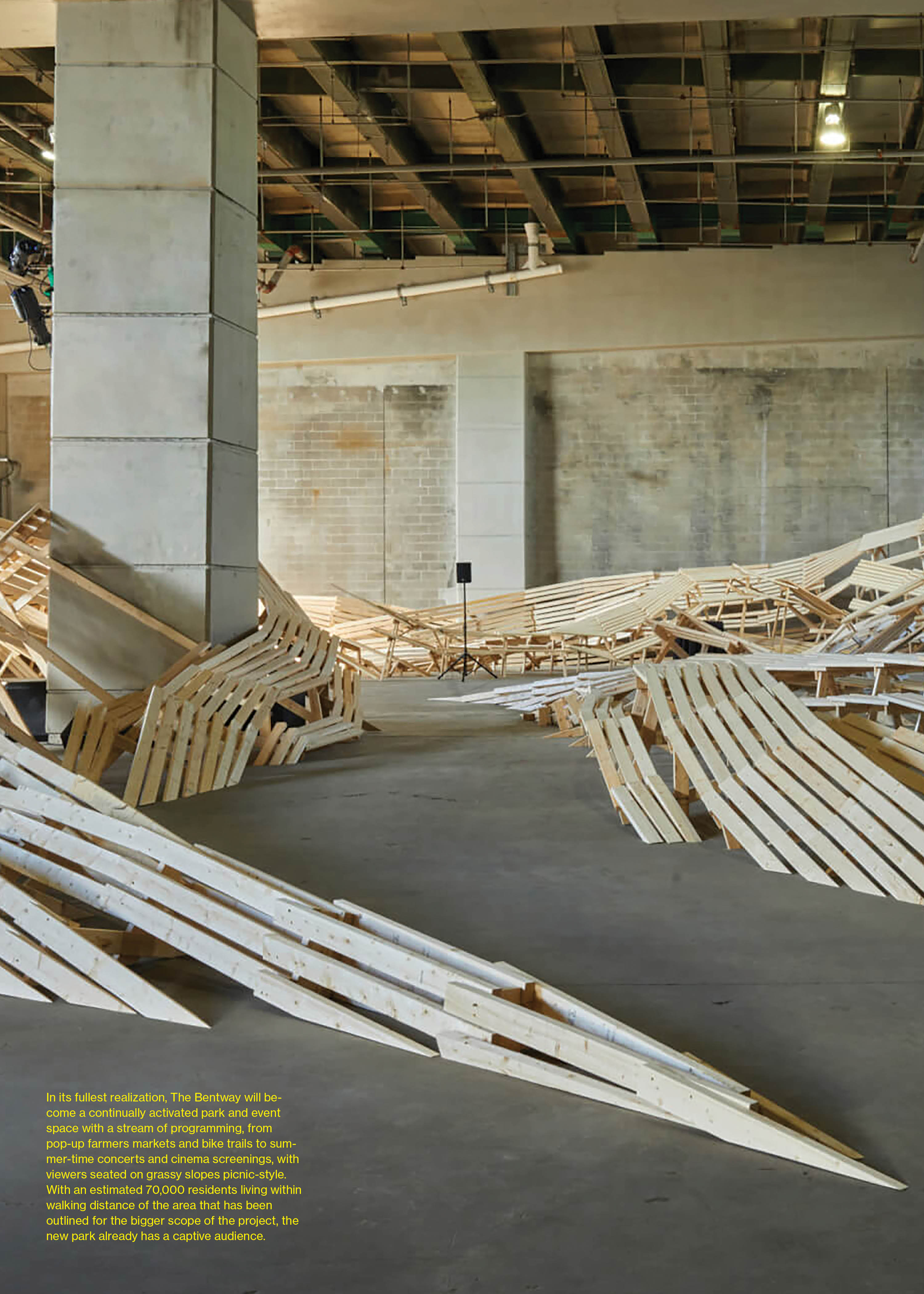
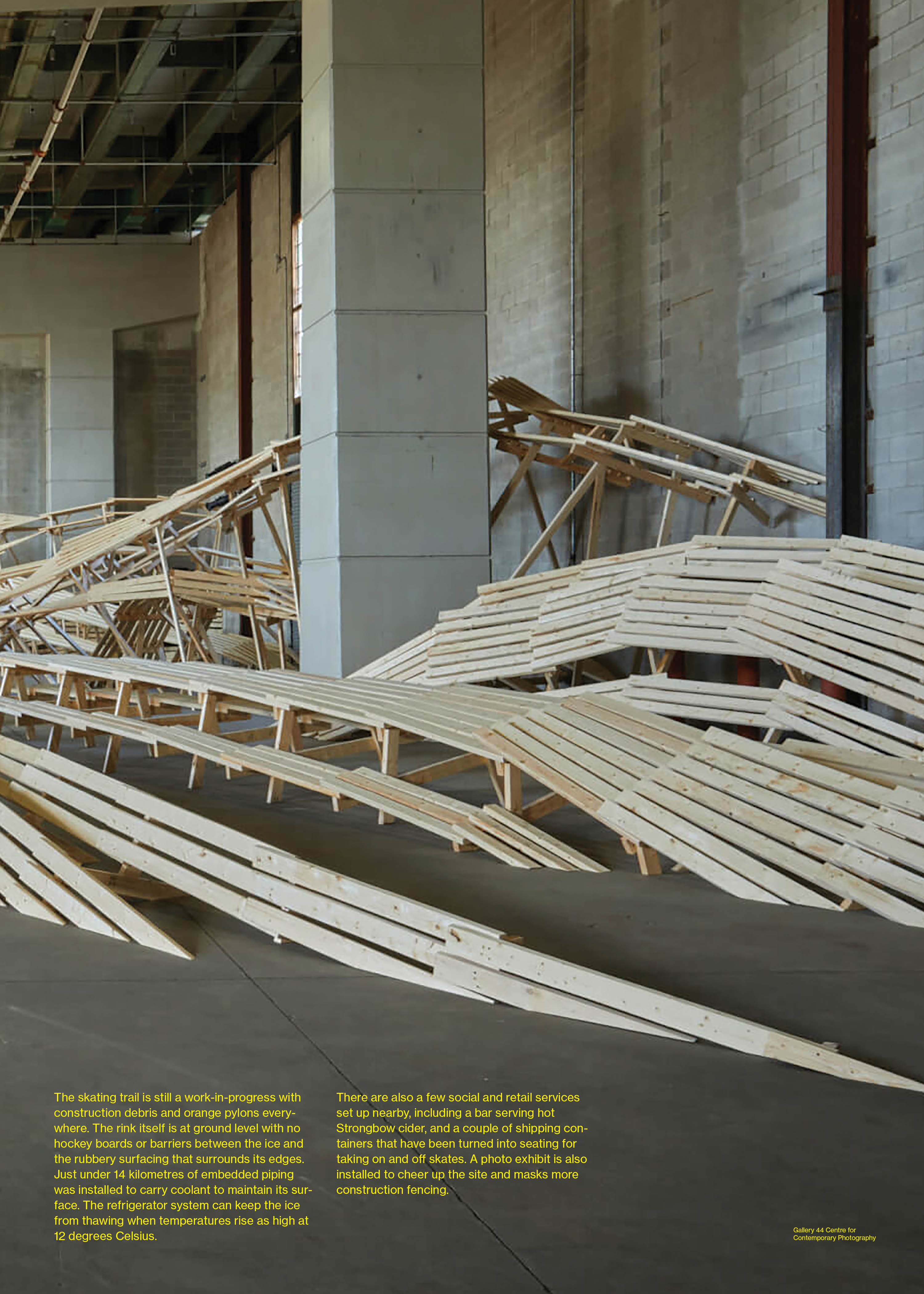
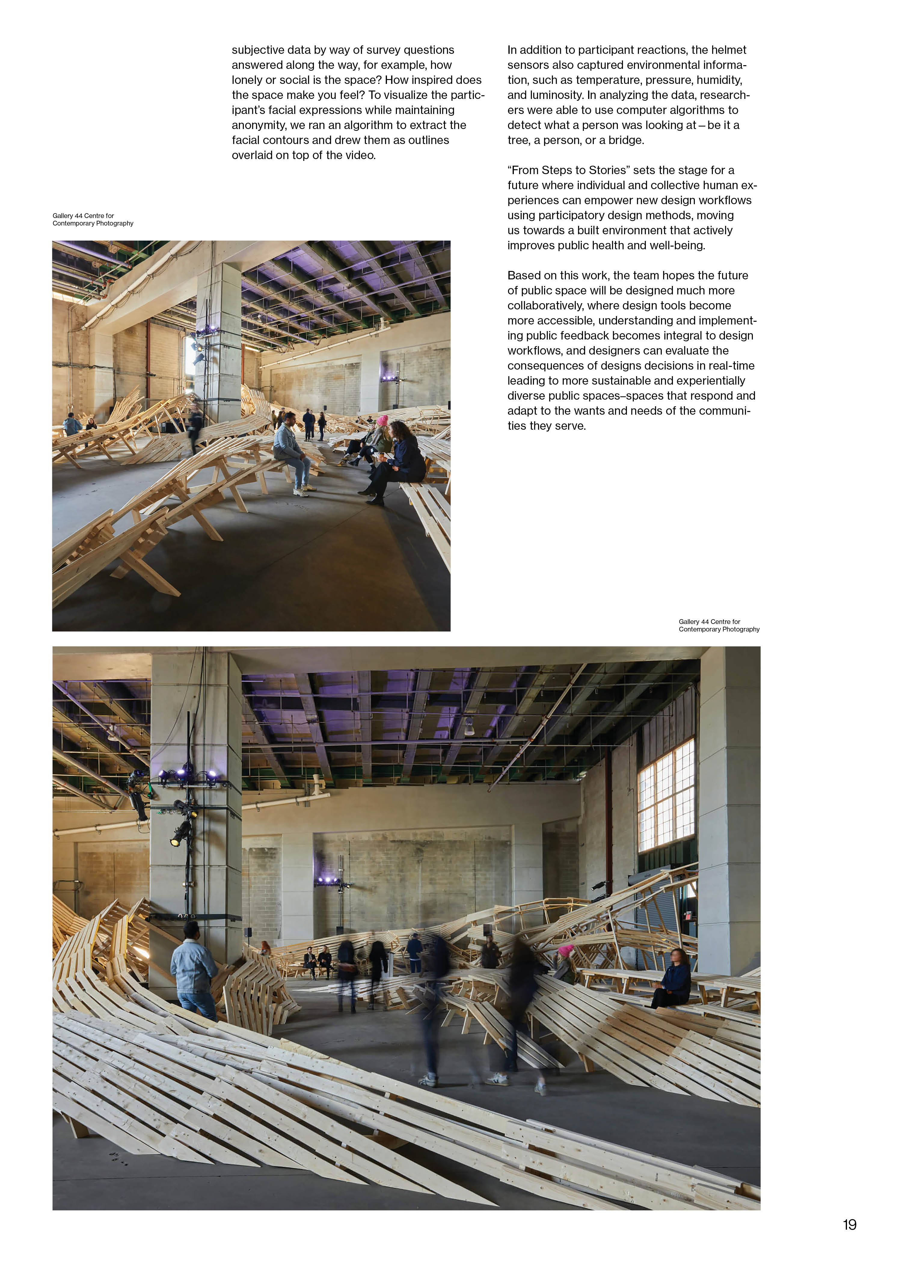
Meet The Bentway, a Cathedral-like Park Under a TorontoExpressway
Project located in Toronto, ON
Article 3:
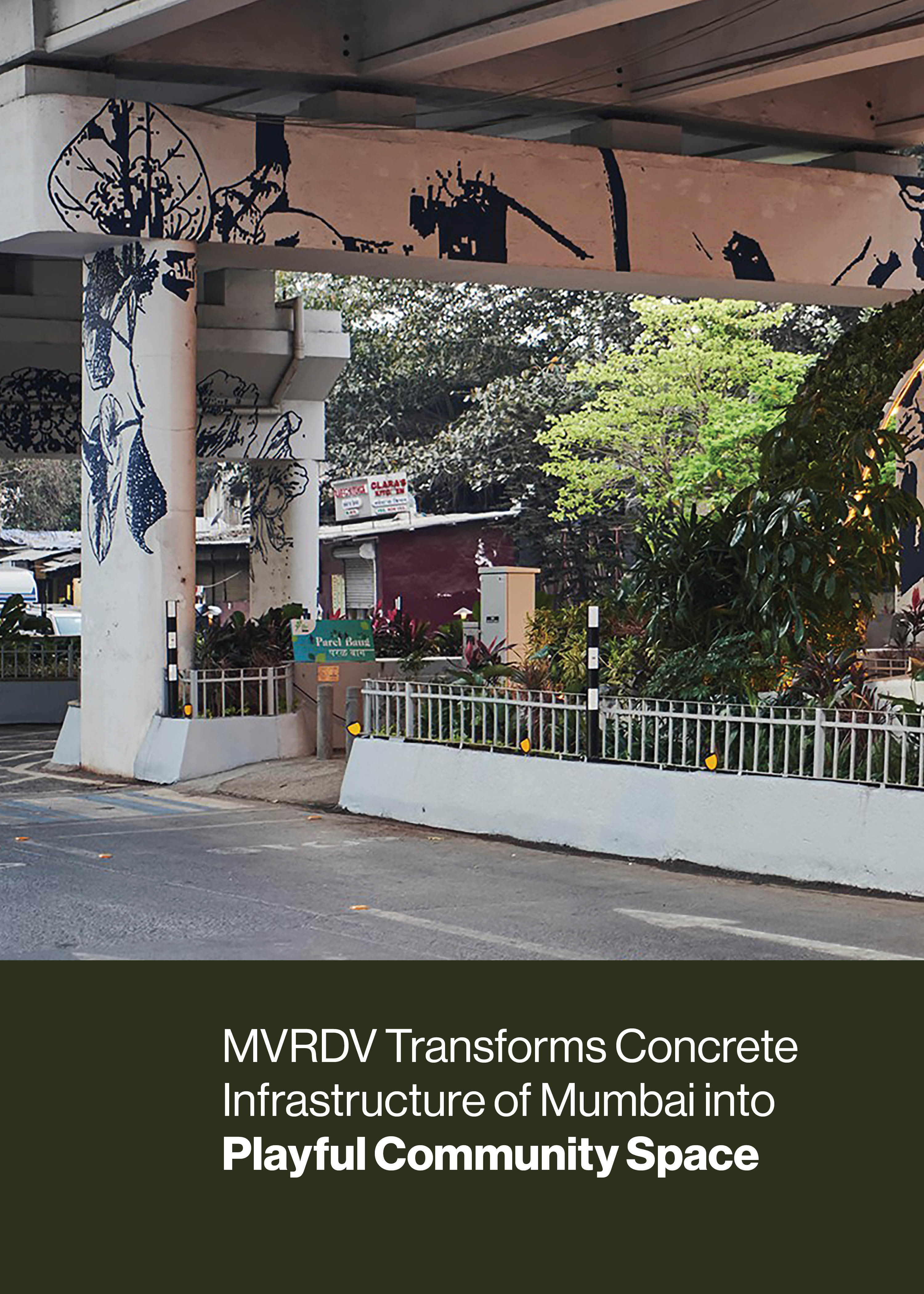
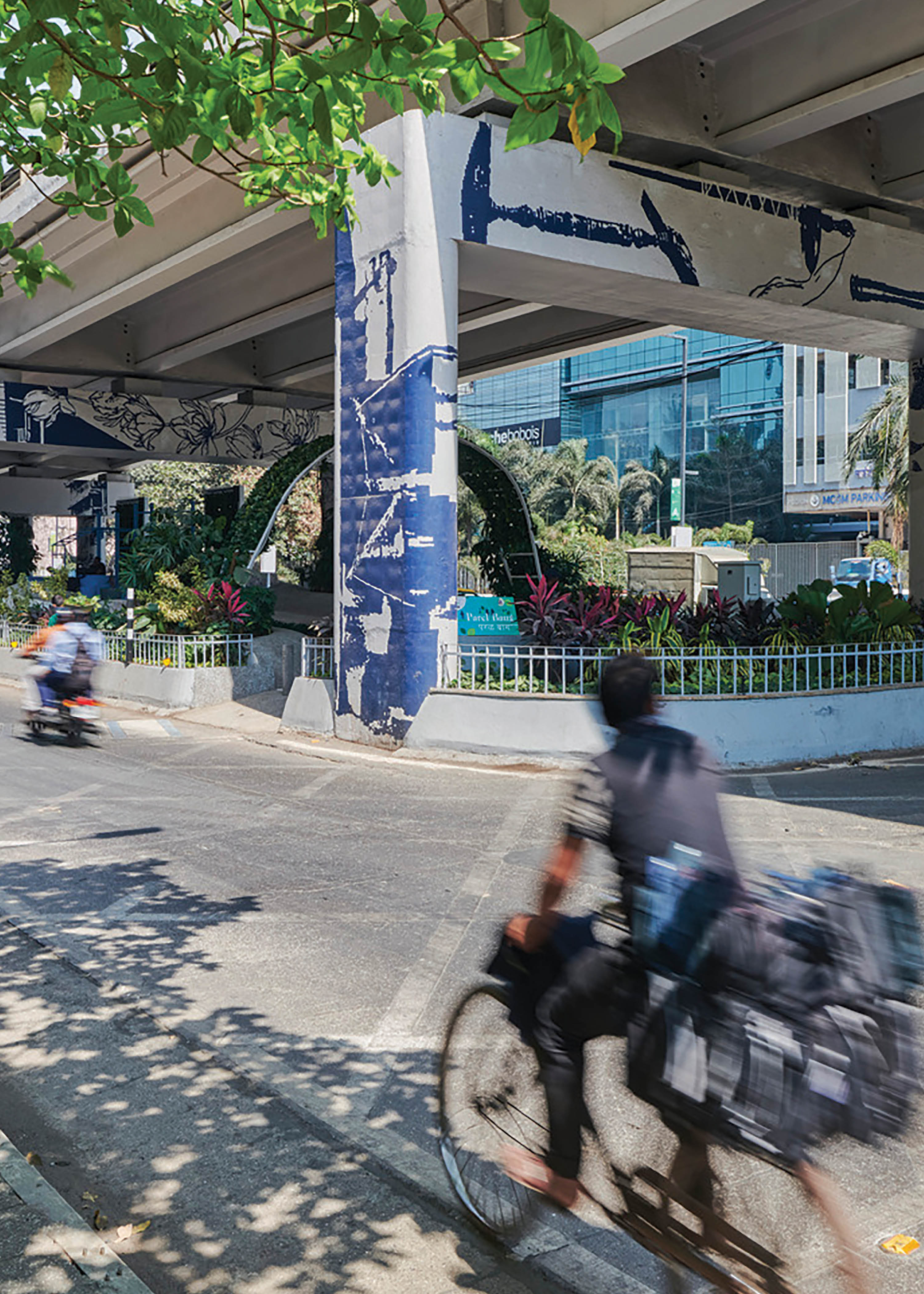
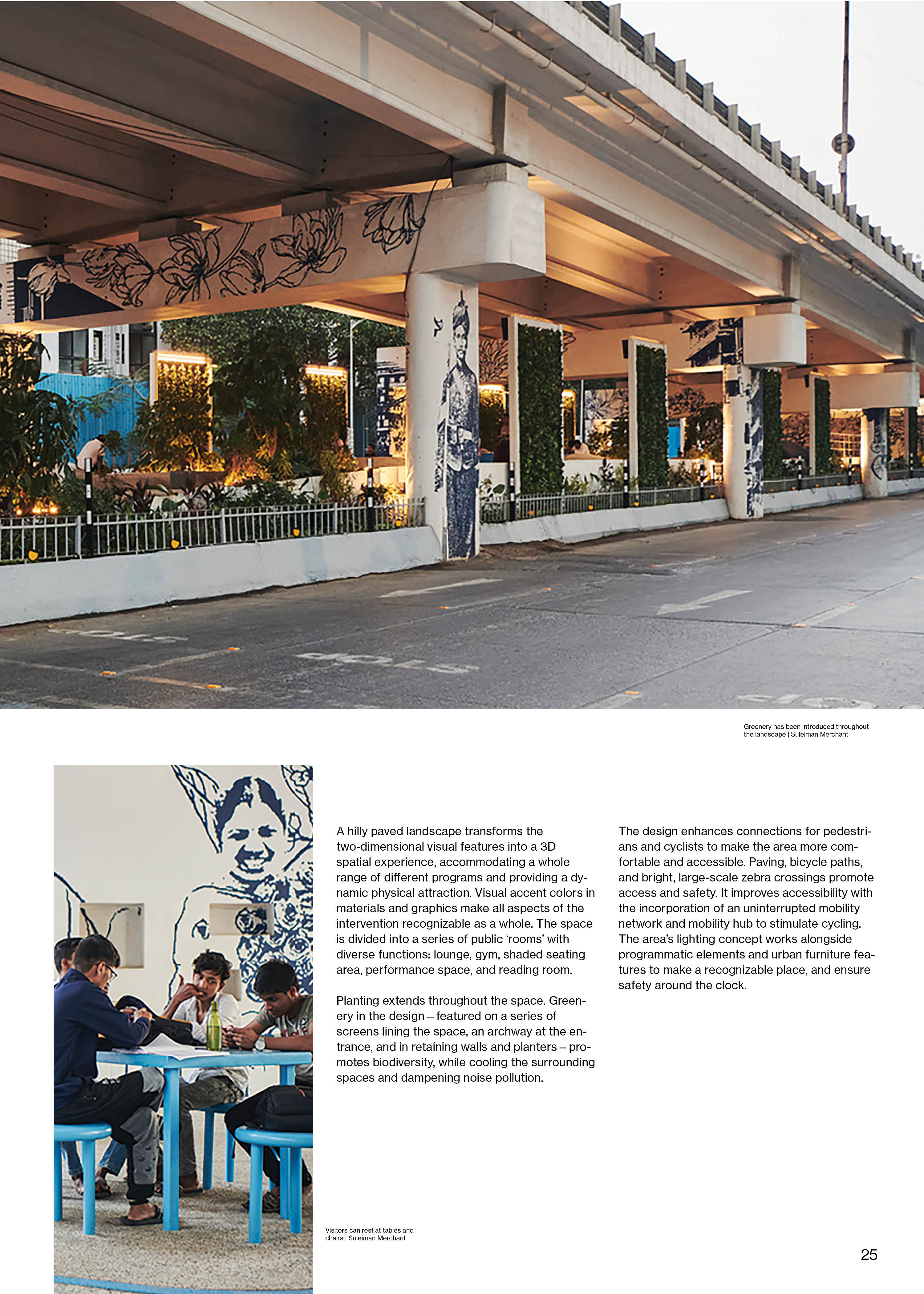
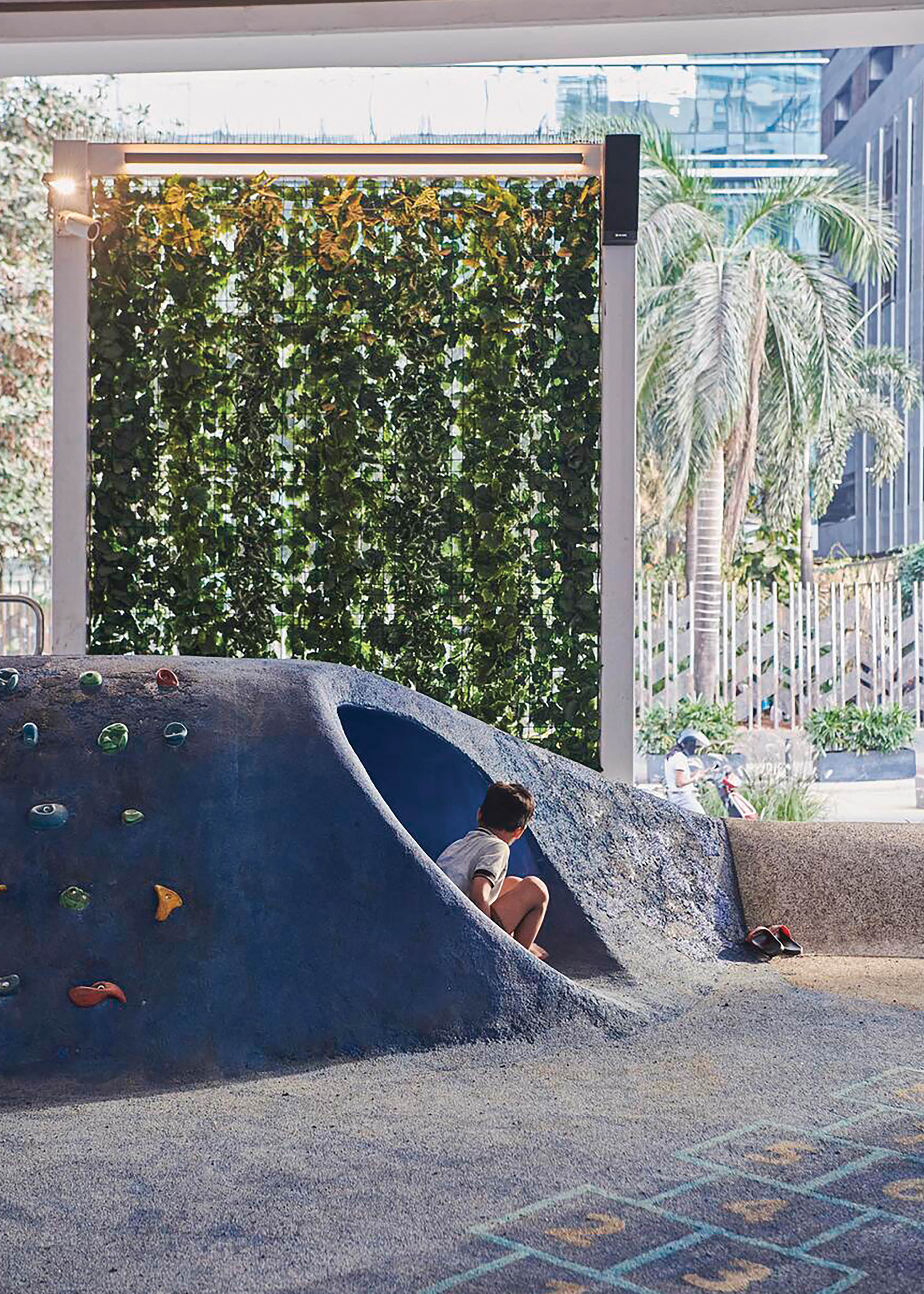
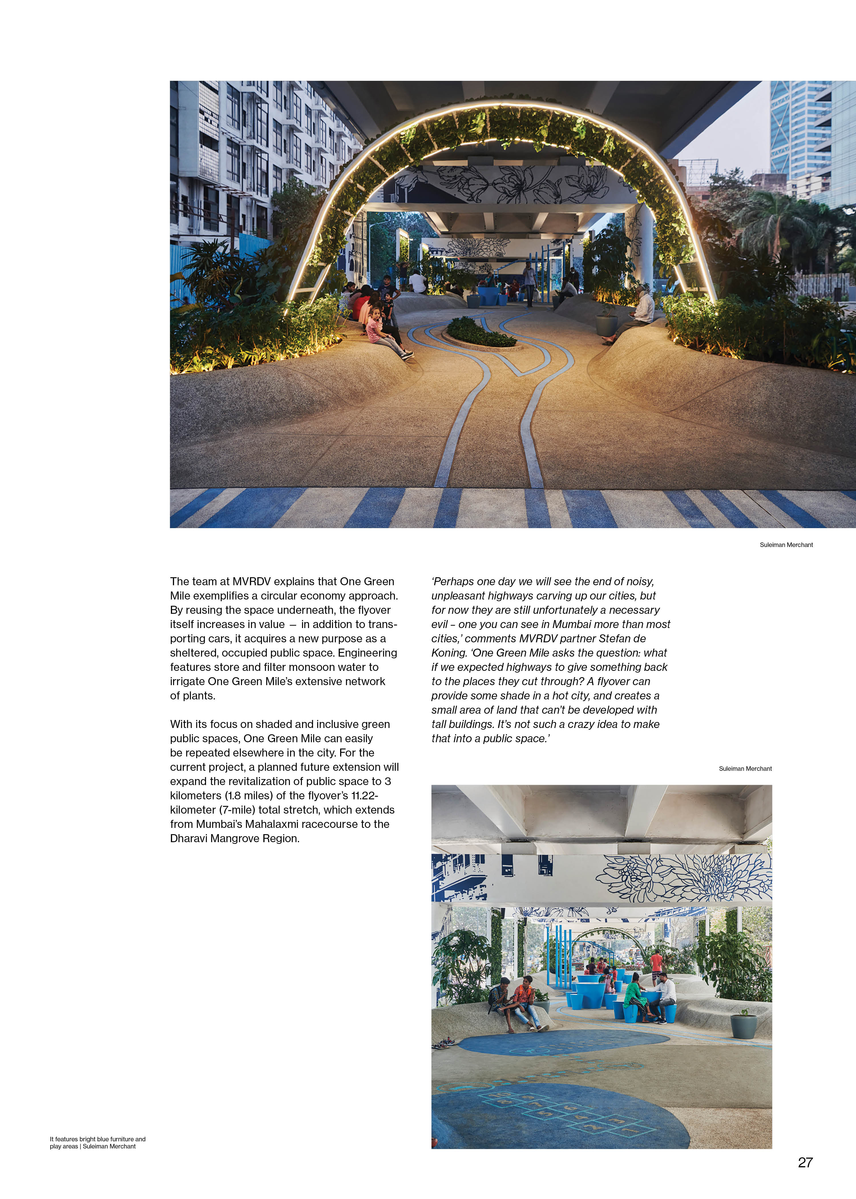
MVRDV Transforms Concrete Infrastructure of Mumbai into Playful Community Space
Project located in Mumbai, India
Design
Color Palette
I worked with earthy tones paired with bold accents to mirror the harmony of natural and urban elements in revitalized designs.
Typography
I chose a modern sans-serif typeface to reflect the clean lines and forward-thinking nature of revitalized spaces. For feature articles, I used a contrasting serif font to bring a sense of sophistication and depth.
Layout
I used a grid-based layout to create a structured, balanced feel, inspired by architectural blueprints. White space was key to giving the design a modern, minimal look while allowing the content to shine.
Cover Design
Reflection
This project taught me how to blend content, design, and tactile elements into a cohesive experience. Urban Uplift isn’t just a magazine—it’s a celebration of how creativity and design can transform the world around us. Through this project, I’ve gained a deeper appreciation for how design influences perception and inspires change.